Category sameness
Lookalike chargers
Most EV hardware brands feel interchangeable — loud bolts, cold blues, no point of view.
A new brand entering the American EV charging market — from messaging and logo through product design, web commerce, and a more human mobile experience.
Problem
Category sameness
Most EV hardware brands feel interchangeable — loud bolts, cold blues, no point of view.
Commerce gap
They needed a stand-alone site where brand, purchase, and support stay one continuous path.
Ownership
Charging had to feel human on phone — not like an industrial control panel.
The client arrived with a simple, elusive goal: pull away from the competition and become the charger with a striking name and presence. We defined the brand side-by-side with them — messaging, logo, product design, website, and mobile app — and built commerce on Shopify so lead generation to purchase to post-sale support stayed one experience.
Approach
Once the sameness problem was clear, we refused to start with a logo contest. The method was to lock the audience and attitude first, then let brand, product, web, and app follow that same filter — so every surface pulled in one direction instead of three teams inventing three FlowGos.
Research
With research partners we ran 98 paid surveys and interviewed 7 EV owners to find who would actually invest in a premium charger — and which language felt credible versus try-hard.
Method
We translated the research into a tight positioning concept, then used it as the decision filter for naming, identity, product form, Shopify storytelling, and the daily charge ritual in the app.
Collaboration
Product design, research, and graphic design sat in the same loop with the client — reviewing interviews, critiques, and prototypes together so brand and product never drifted apart midstream.
Insights
Finding 01
Buyers could not tell hardware brands apart. Bolt icons and cold blues read as commodity — premium intent needed a sharper point of view, not louder tech theater.
Finding 02
Affluent buyers responded to control, ritual, and self-direction. Virtue-led EV messaging felt try-hard; confidence without volume felt credible.
Finding 03
Purchase was only half the job. Setup, charge status, and support on the phone decided whether ownership felt premium — or like an industrial panel at home.
Positioning
The research coalesced around a clear buyer profile: daring, affluent, and autonomous. The brand system was centered on that concept — confident without being loud — and it became the shared standard for every identity, web, and app decision that followed.






Branding
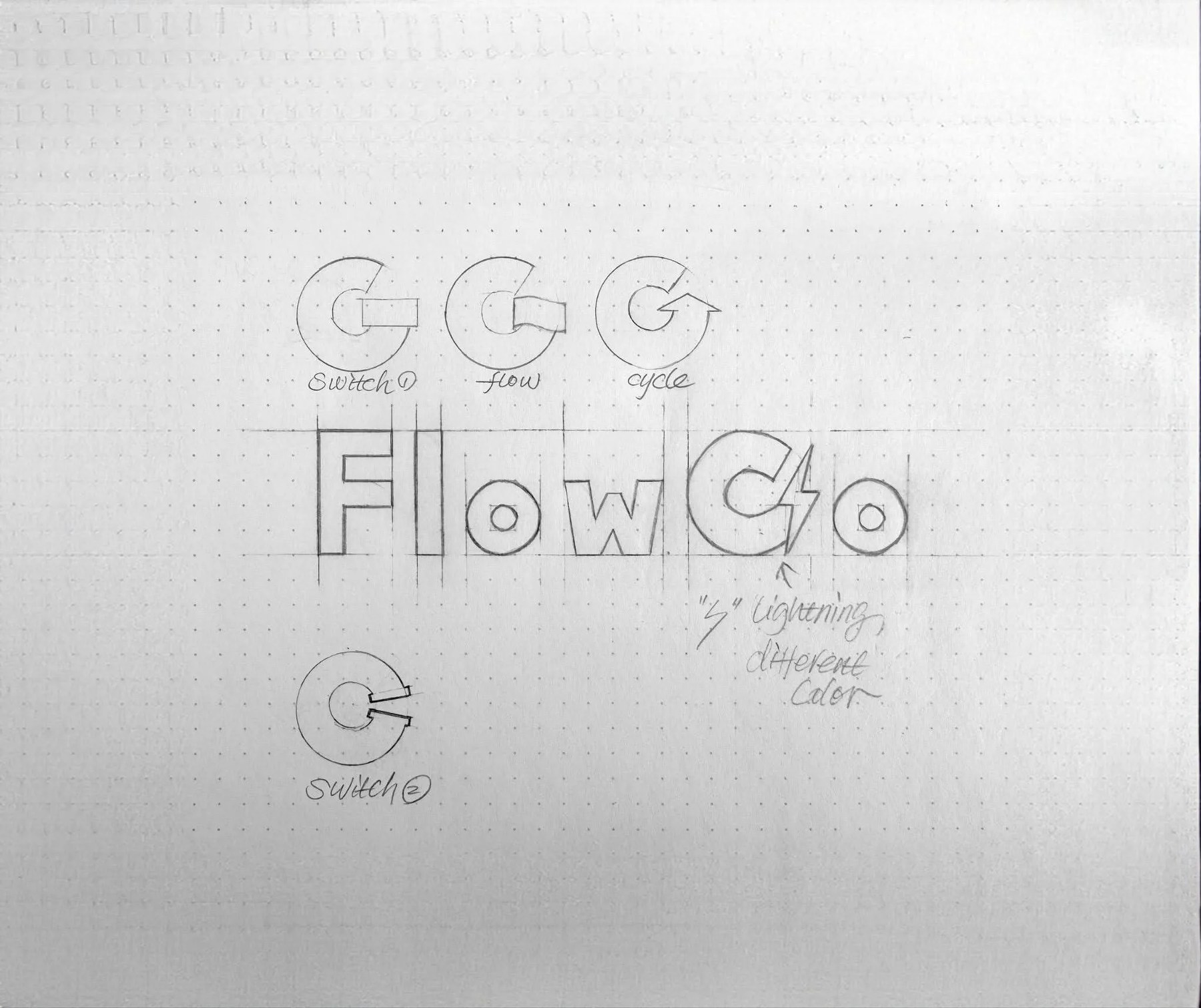
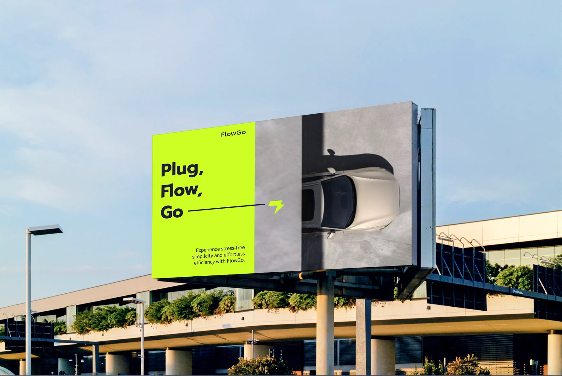
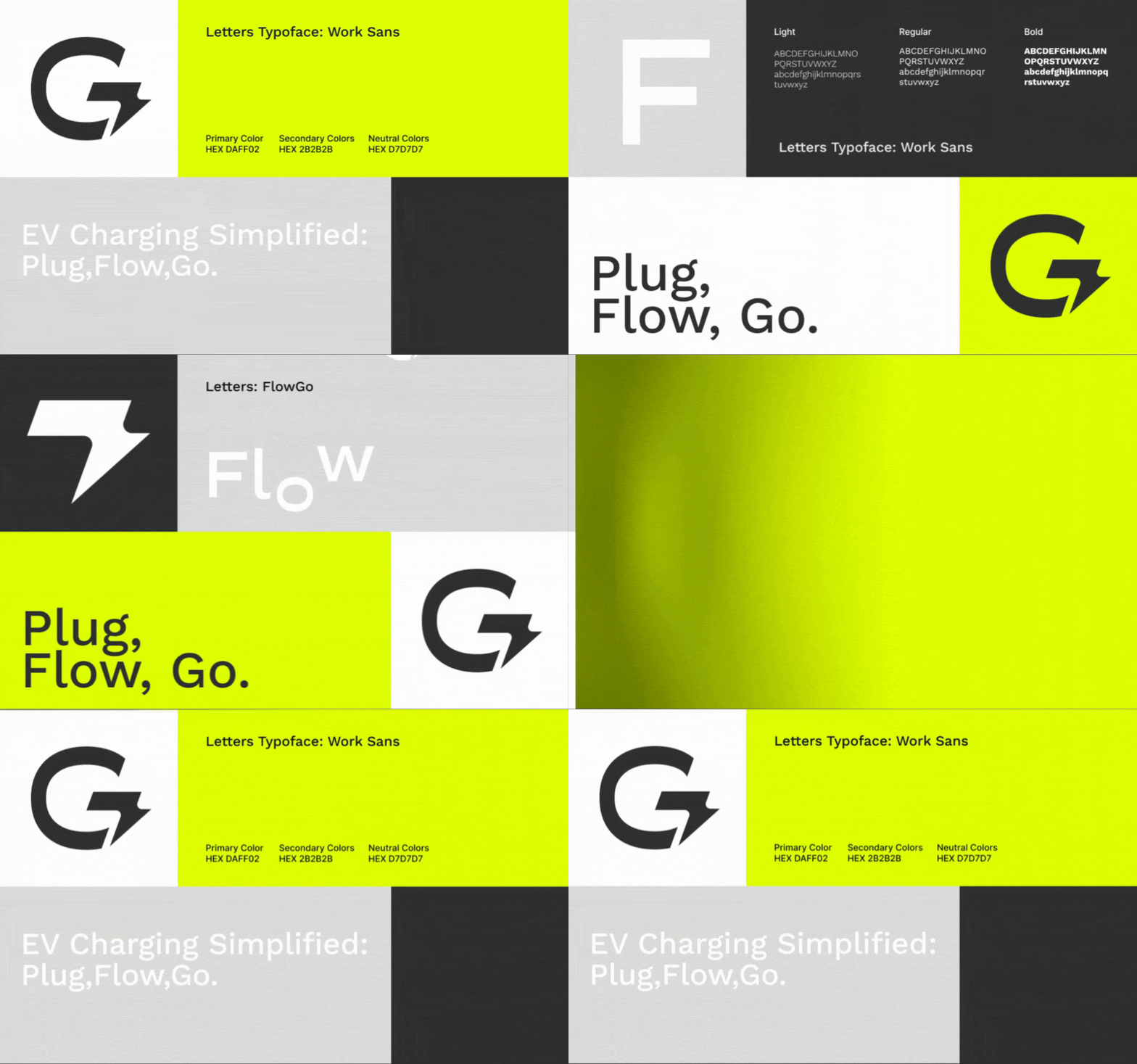
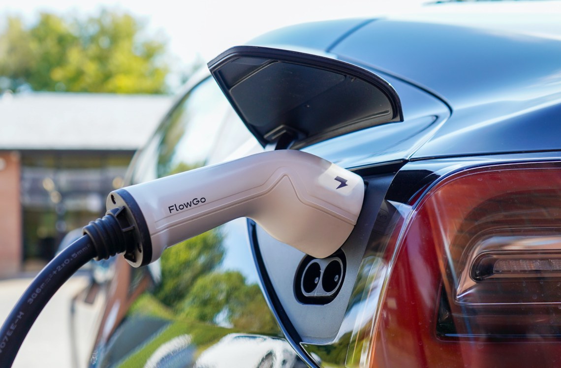
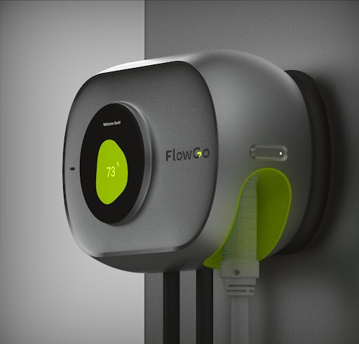
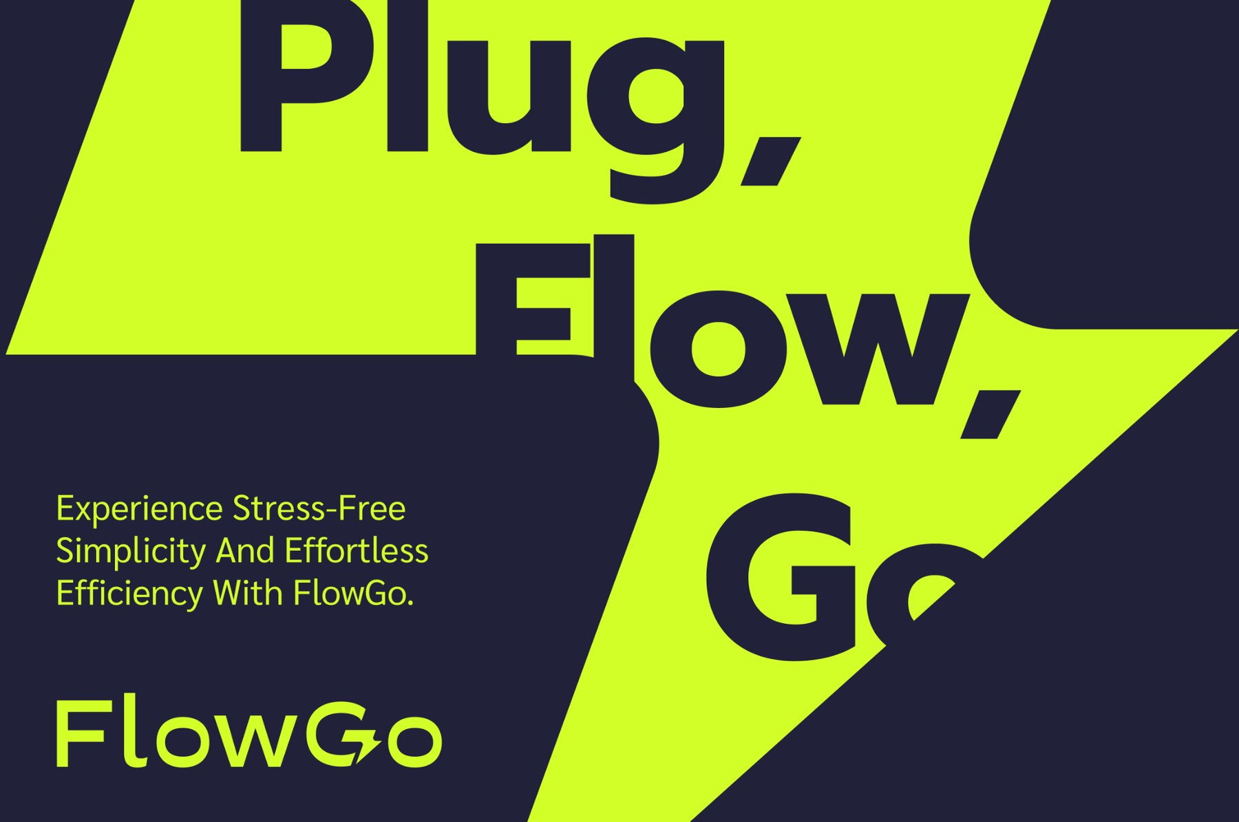
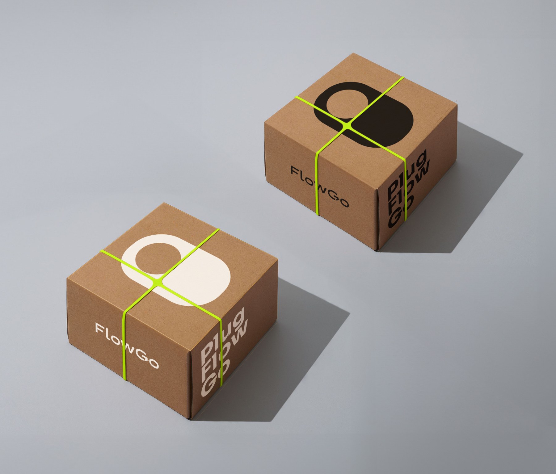
Branding work spanned identity, typography, packaging language, and campaign visuals — designed to feel premium at the driveway and credible on a product detail page.
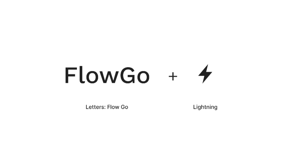
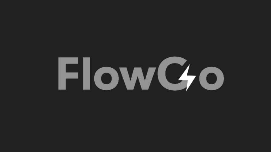

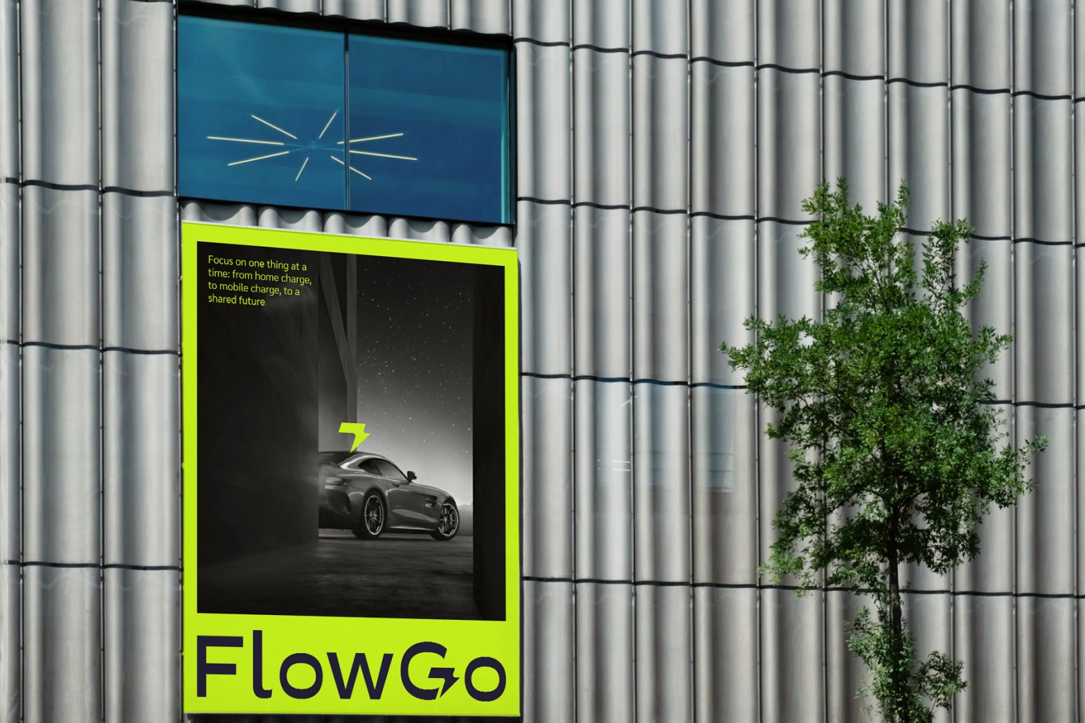
Design system
Branding became a small UI kit: lime action states, a neutral ramp, and a two-font scale (Sora for headings, Sarabun for body and controls) that holds up on the consumer website from wide desktop layouts down to a phone-width storefront.
Color
#EBFF9F
RGB 235, 255, 159
#D2FF2A
RGB 210, 255, 42
#B3D924
RGB 179, 217, 36
#A6AB95
RGB 166, 171, 149
#FFFFFF
RGB 255, 255, 255
#EFEFEF
RGB 239, 239, 239
#B0B0B0
RGB 176, 176, 176
#6F6F6F
RGB 111, 111, 111
#3F3F3F
RGB 63, 63, 63
#2B2B2B
RGB 43, 43, 43
Typography
Sora Regular · 60 → 36Sora Regular · 40 → 28Sora Regular · 24 → 20Sora Regular · 20 → 18Sarabun Regular · 18Sarabun Medium · 18Sarabun Regular · 18Sarabun Regular · 14Responsive
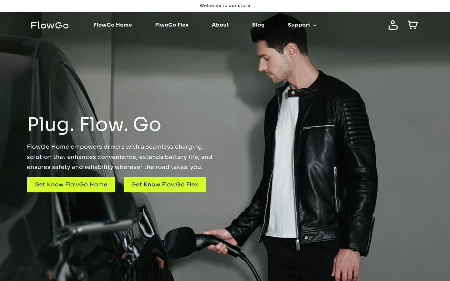
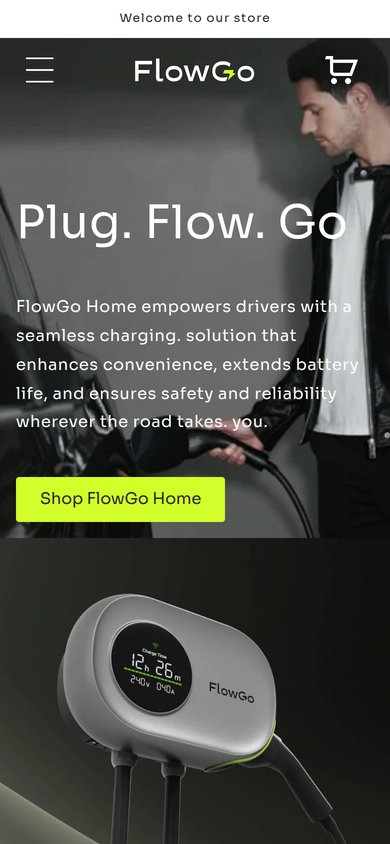
Website
The Shopify experience connects discovery to ownership — product storytelling, trust signals, and a checkout path that feels as considered as the hardware. Alongside the UI, I partnered with a content writer on SEO planning so page copy stayed search-aware as product SKUs and positioning evolved — without sounding like keyword stuffing.
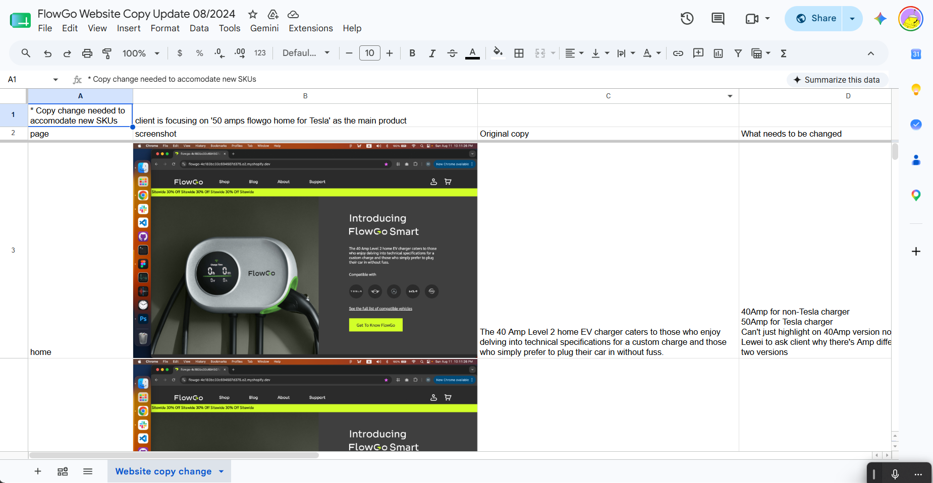
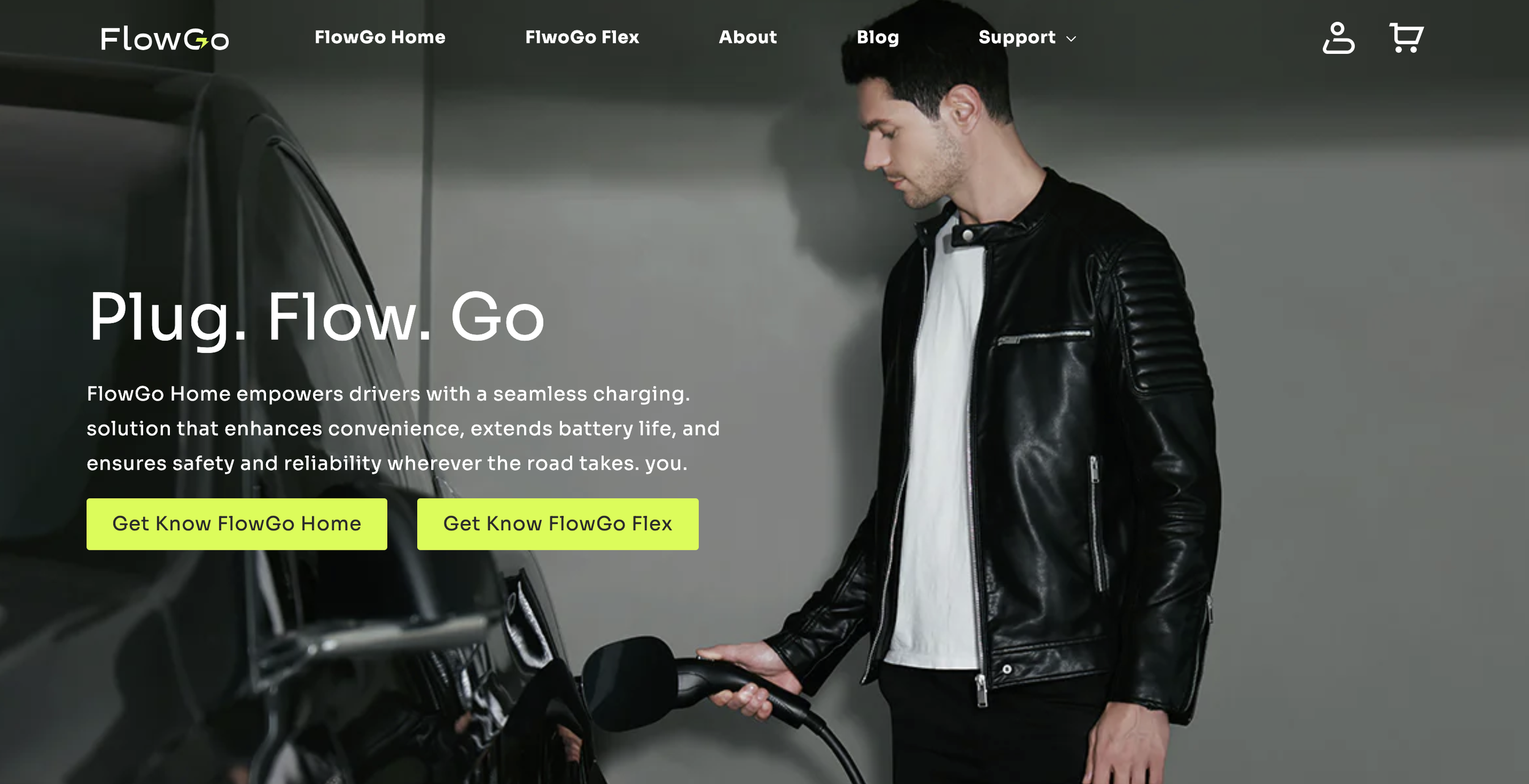
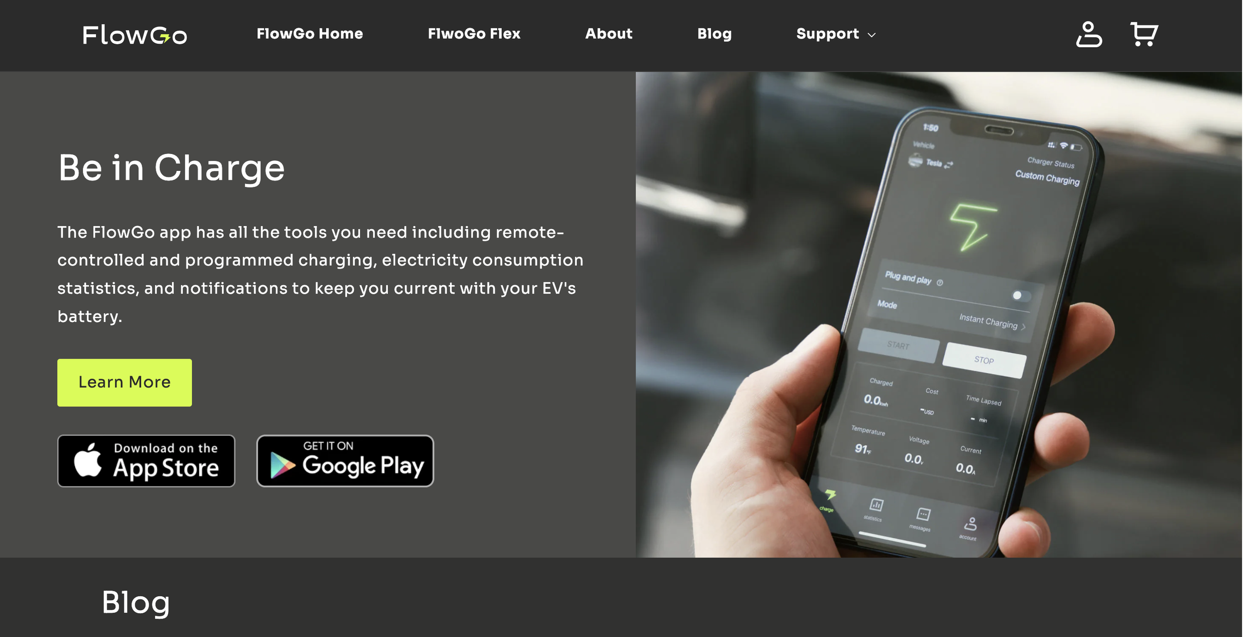
Live site: getflowgo.com
Mobile app
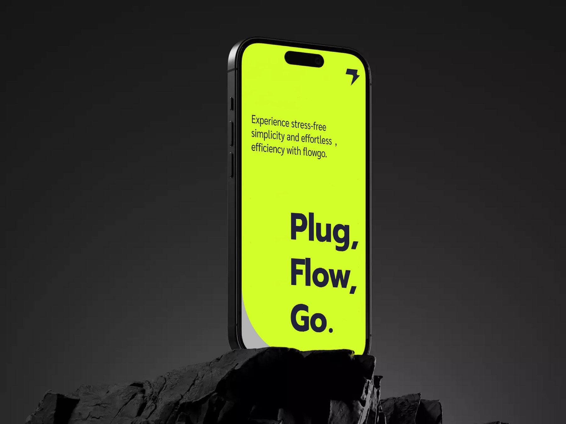
The app extends ownership after purchase: starting and monitoring charge sessions, understanding usage, receiving timely messages, and managing account preferences — designed to feel human rather than industrial.


Primary jobs
Charge is the hero job. Statistics and messages support it without competing for attention — calm control for a driveway ritual people repeat every day.
Supporting jobs
Timely notices and settings stay available without turning the app into a utility maze.
Continue