Funnel
Drop-offs
Prior campaign pages lost shoppers before the offer felt clear or trustworthy.
As product design lead at a NYC agency, I owned ecommerce branding and performance for Petlibro — pairing analytics, strategy, and UI execution across campaigns and the broader storefront. This case focuses on one holiday sales campaign to show that approach in action; it lifted revenue by 56%.
Problem
Funnel
Prior campaign pages lost shoppers before the offer felt clear or trustworthy.
Bounce
Previous campaign pages bounced hard — the Labor Day page needed a different hierarchy.
Creative
Ads and modules that didn’t match the brand’s best customers were cut or rebuilt.
The challenge was a Labor Day sales campaign that had to beat that pattern — not another page that buried the offer and spent ad budget on creative that didn’t match Petlibro’s best customers. Funnel drop-offs, bounce on prior campaign pages, and underperforming modules defined the brief: pair analytics with landing, CRM, and ads so the system converted as one narrative.
Method
Before inventing a new Labor Day layout, I logged into Google Analytics to review how prior campaign pages actually performed. That meant matching each past landing design to its results — and reading section-level paths to see where shoppers dropped off versus where they continued toward purchase.
Analytics defined the landing system — then UI made those priorities visible in under a scroll.
Campaign system
Landing page design, social, and email ran as one offer story — with product analytics steering what we pushed where. I owned the system and collaborated with agency graphic designers on the visual craft, keeping offer clarity, hierarchy, and warmth intact without getting noisy.
Landing page
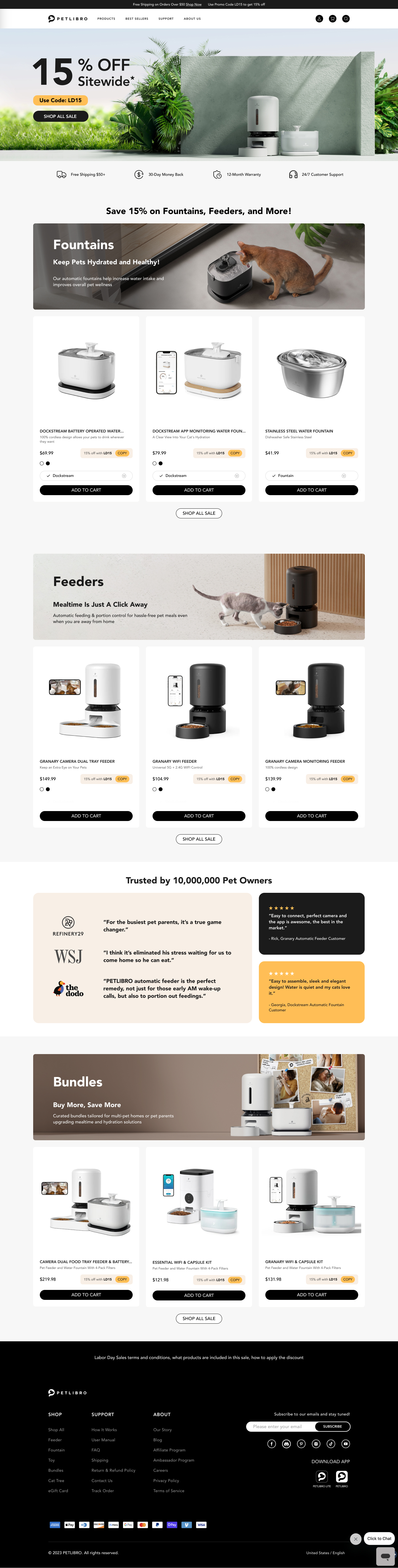
After the Shopify and Analytics audit, the pattern was clear: the best-performing landings didn’t overwhelm shoppers with endless products. They gave just enough on what each product does — and just enough company credibility — then stopped. That became the wireframe brief for desktop and mobile.
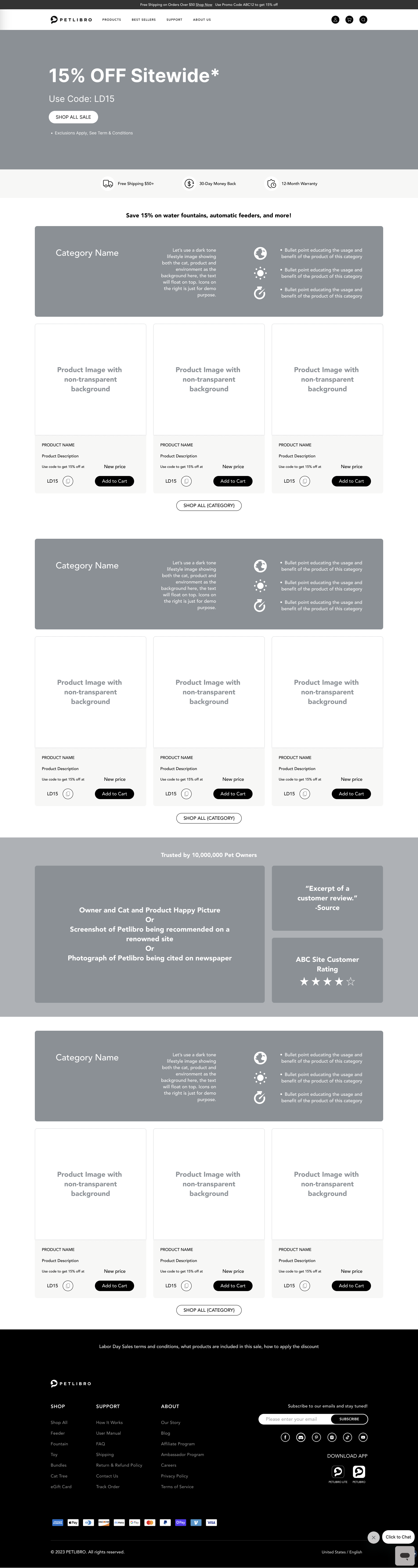

Scroll either frame to walk the full page structure.
Promo without crowding. A rolling banner carried the sale message up top so the offer stayed visible without stacking more UI onto the page.
Three products per category. Products were grouped with short category info, then only three SKUs under each — enough choice to shop, not a wall of inventory.
Credibility on the page. Press mentions and owner reviews sat in the flow so trust didn’t depend on another product grid.
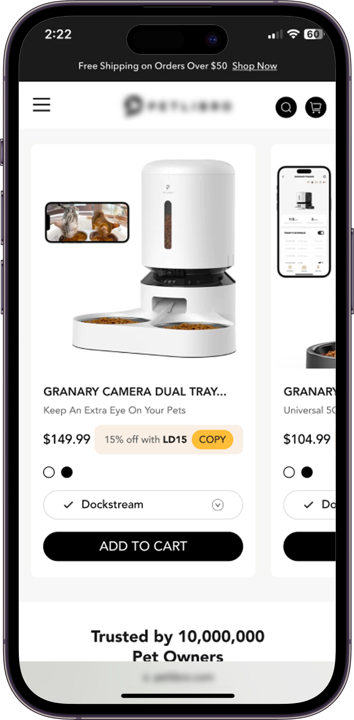
Mobile isn’t a shrunk desktop. To use the smaller screen and touch, category sections became horizontal carousels — so shoppers could browse without endless vertical scrolling. Each carousel still capped at three product cards, so the swipe distance stayed short.
Final desktop and mobile. The polished landing carried the same story on both surfaces — desktop for breadth, mobile for touch — without overloading either.

Scroll the frames for the full hi-fi page.
Feedback
Delivery was not the finish line. After the holiday campaign shipped, we checked whether the page still lost shoppers before the offer landed — and whether paid traffic converted more efficiently than prior campaigns.
Problem we were solving
Earlier campaign pages averaged about 70.7% bounce. Shoppers left before trust and the deal hierarchy landed — so success meant holding attention long enough to convert, not just launching a prettier sale page.
Decision
Analytics set the hierarchy; craft kept it warm. We aligned landing, social, and CRM to the same offer path so paid traffic met a page that already answered what to buy and why to trust it.
Result
Bounce rate dropped 26%. Revenue for the campaign window rose 56%. ROAS hit a record for the account — and the client celebrated the sales window in writing.
How we measured success
We measured against the pre-campaign failure mode: bounce rate (did shoppers stay?), revenue lift in the campaign window, and ROAS on the paid spend that fed the landing page. Those three answered whether the design solved the problem — not just whether it shipped on time.
Continue
Social & email
Same offer story off the site
Ads and email promo design carried the landing narrative into paid and owned channels — so the promise people saw in social or inbox matched what they landed on. I collaborated with agency graphic designers on the visual craft while keeping hierarchy and offer clarity consistent.