Attention
Seconds, not sessions
Categories and signatures have to land before the traveler looks back at the board.
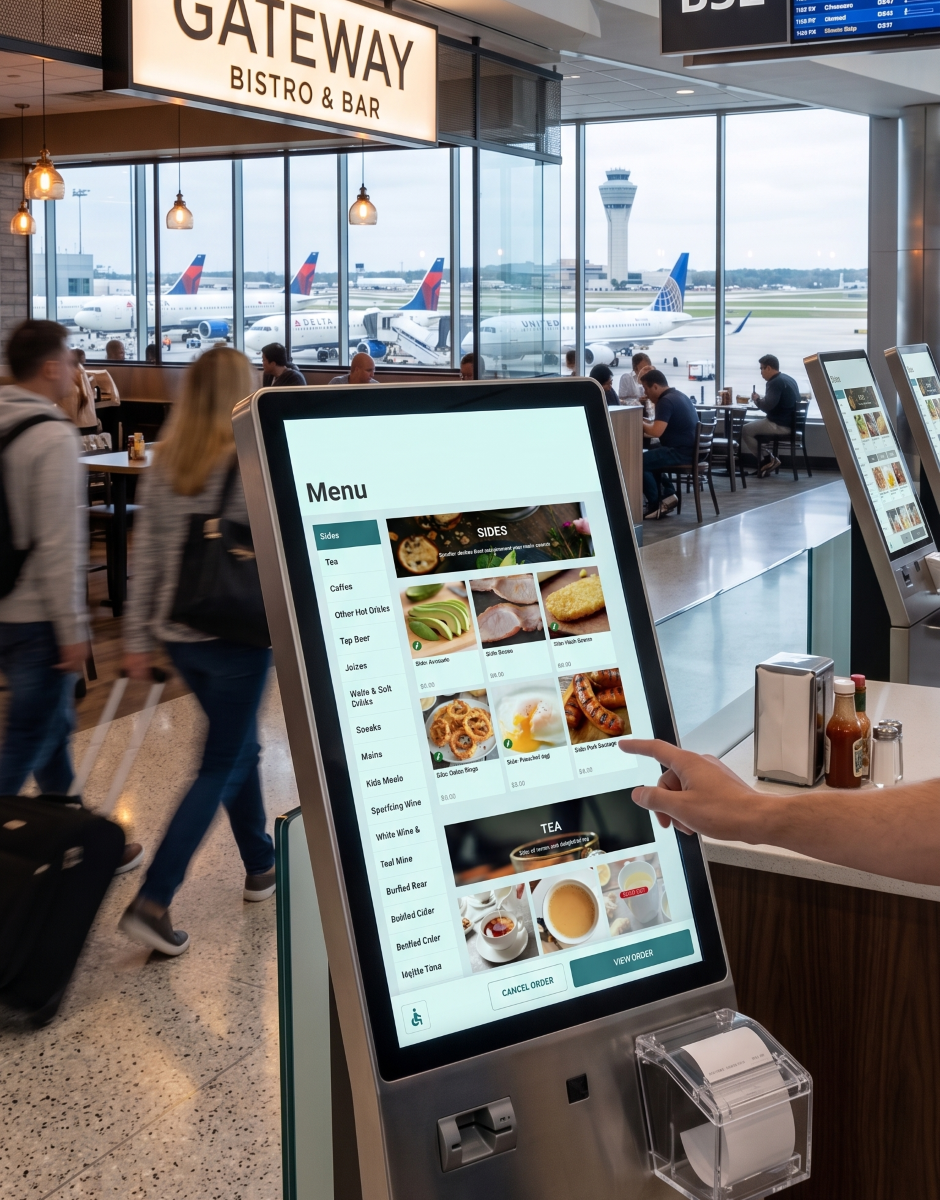
Designing one ordering language for airport restaurants — so travelers can browse, customize, and pay under boarding pressure, whether they stand at a kiosk, order from a seat, or open the web menu.
Under NDA. Only client-approved materials appear here. The work below is a partial view — enough to show the problem, the model, the living design system, and the craft bar.
Problem
Airport dining is a hostile UX environment: glare, noise, bags in both hands, multilingual travelers, and boarding-time anxiety. A flow that feels elegant in a quiet café can fail when someone has eight minutes before a gate change.
The product risk was fragmentation. Three surfaces designed as three products would force travelers to relearn ordering mid-trip — and force restaurants to maintain three truths about the same menu. The design problem was not “make a nice kiosk.” It was one mental model that still works when attention is scarce.
Attention
Categories and signatures have to land before the traveler looks back at the board.
Interruptions
Glare, gloves, companion questions, and app switching are normal — not edge cases.
Trust
Upsells and modifiers only work if impact is visible and reversible under pressure.
Model
The ordering spine stays constant across surfaces: browse → item → customize → cart → pay. Photography and labels carry recognition; customization is progressive; the cart is a confirmation cockpit, not a surprise total.
What stays unified is the job sequence and catalog meaning. What is allowed to diverge is density, gesture, and emphasis — kiosk leans on visual browse; mobile leans on compact detail and sheets; desktop uses higher bandwidth and modals without inventing a new language.
Unified
Same catalog model, same customization rules, same commit logic — so a traveler who starts on one surface can finish on another without relearning the product.
Adaptive
Layout, chrome, and interaction density flex by device. The decision model does not — that is what keeps omni from becoming three disconnected apps.
Design system
Mondo Connex needed an enterprise design system that could hold guest ordering and operator tools in one family: tokens, components, and interaction rules that ship with features instead of drifting per screen. This is product infrastructure I maintain and update with releases — foundations first, then components, then patterns — so new work inherits the model instead of reinventing chrome.
It is not a brand guideline. Brand expression can flex by restaurant; the system protects usability floors, state clarity, and a shared vocabulary across kiosk, mobile, desktop, and admin.
Foundations · Color
#307074
Add to cart, steppers, key actions
#3F8589
Interactive lift without a new hue
#9EB5B7
Unavailable actions stay in-family
#1AAEAA
Sidebar, toggles, help, focus
#14C4BC
Active nav / selected affordances
#FFFFFF
Cards, sheets, menus
#F0F1F2
Admin page background
#6E7678
Descriptions, helper copy
#1A1A1A
Titles, prices, labels
Foundations · Type
Sans Bold · uppercase · guest headers
Sans Bold · price / total emphasis
Sans Regular · readable under glare
Sans Medium · uppercase UI labels
Sans Regular · admin helper / meta
Sans Medium · uppercase buttons
Foundations · Space
Base unit
8px Spacing, padding, and tap gapsGuest radius
8–12px Buttons, sheets, cardsTouch floor
≥44px Kiosk/mobile primary targetsElevation
Sheet / modal Scrim + raised surface for focusComponents
Buttons
Primary commits; secondary exits; ghost offers optional paths; admin chrome stays distinct.
Quantity stepper
Defaults safe; plus carries the action color; minus stays quieter until needed.
Selection
Checkboxes for guest modifiers; toggles for operator settings with immediate state.
Forms
Admin density with clear labels and helper text — same family, higher information load.
Patterns
Navigation
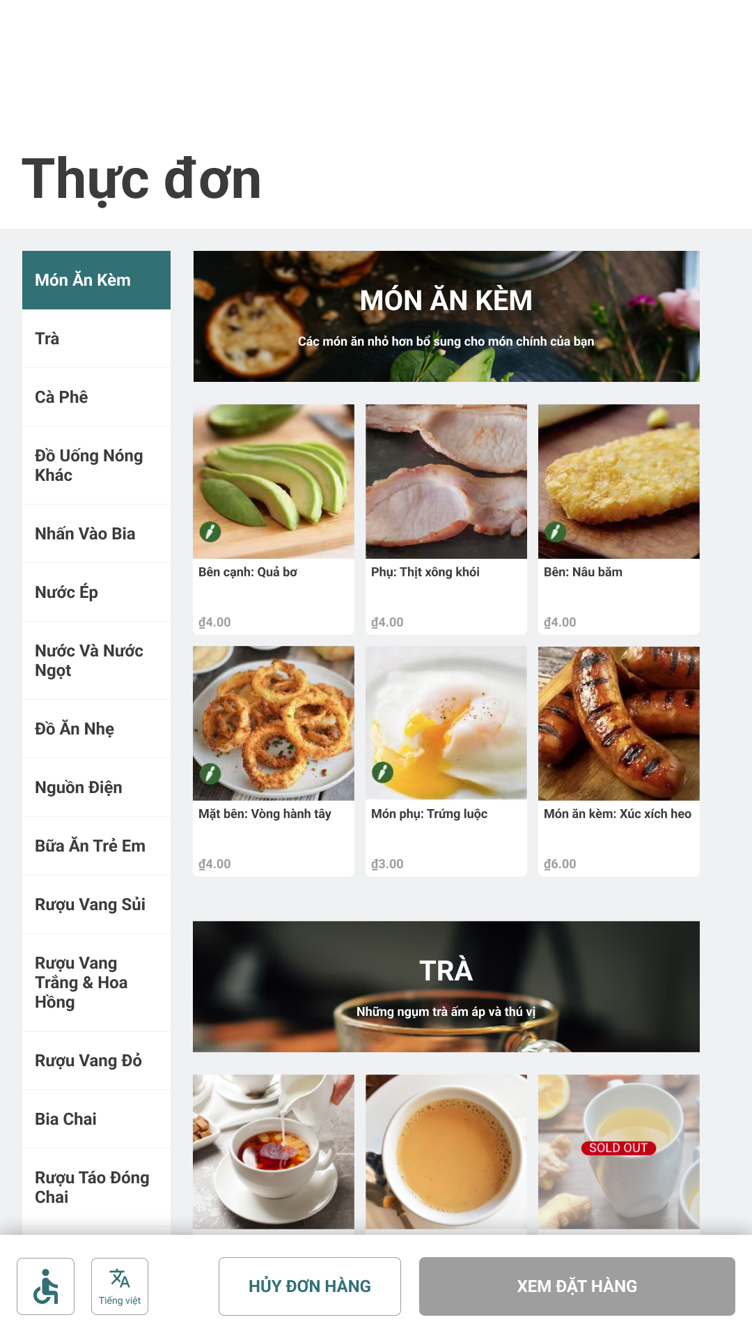
Kiosk footer keeps accessibility, language, and order actions visible. Admin sidebar keeps venue settings findable without burying critical paths.
Feedback
Selected, disabled, and loading states stay in-token. Price impact appears before commit on guest flows; admin toggles reflect state immediately.
Content
Photography and labels do recognition work. System chrome stays quiet enough for food and offers to lead — especially under airport glare and time pressure.
Governance
When a release introduces a new job — meal upsells, service QR modes, campaign builders — the system updates in order: token needs, component extensions, then pattern guidance. That keeps guest and operator surfaces coherent as the product grows, instead of accumulating one-off UI.
Surfaces
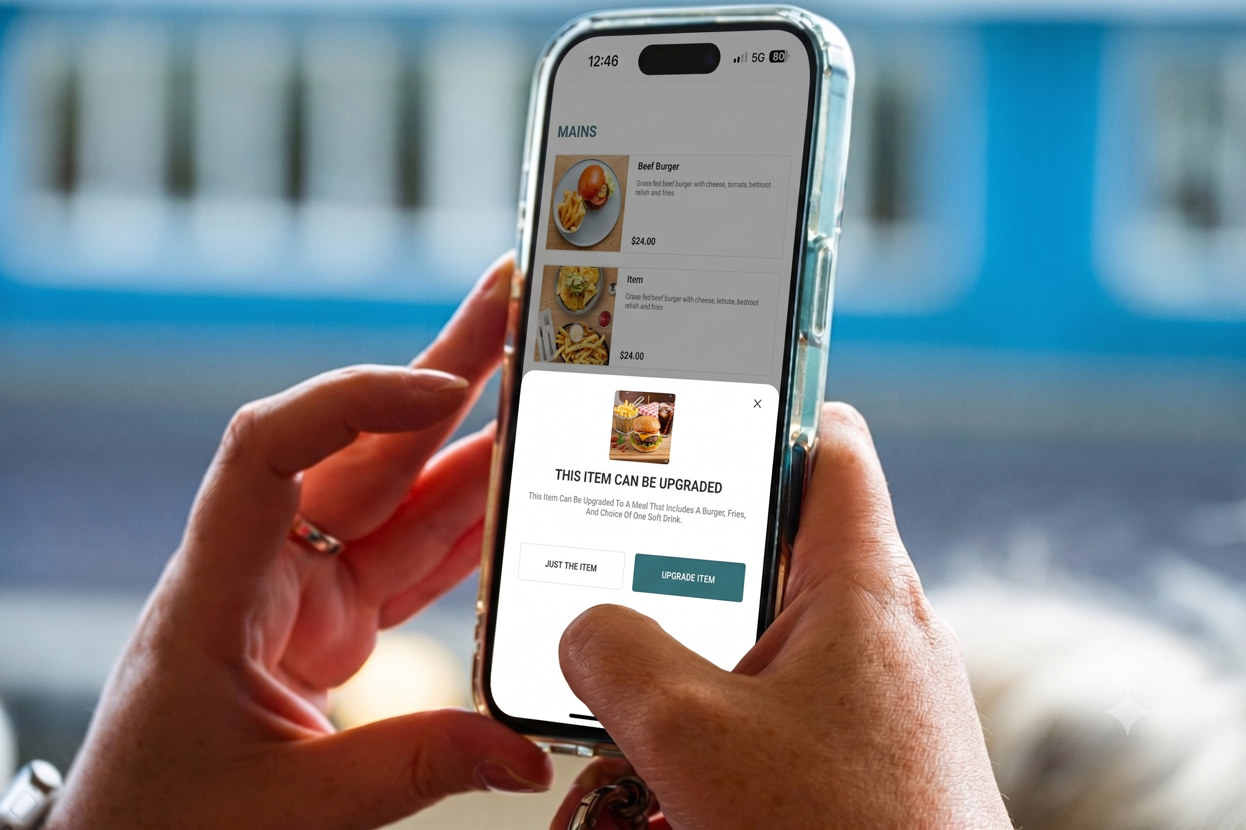
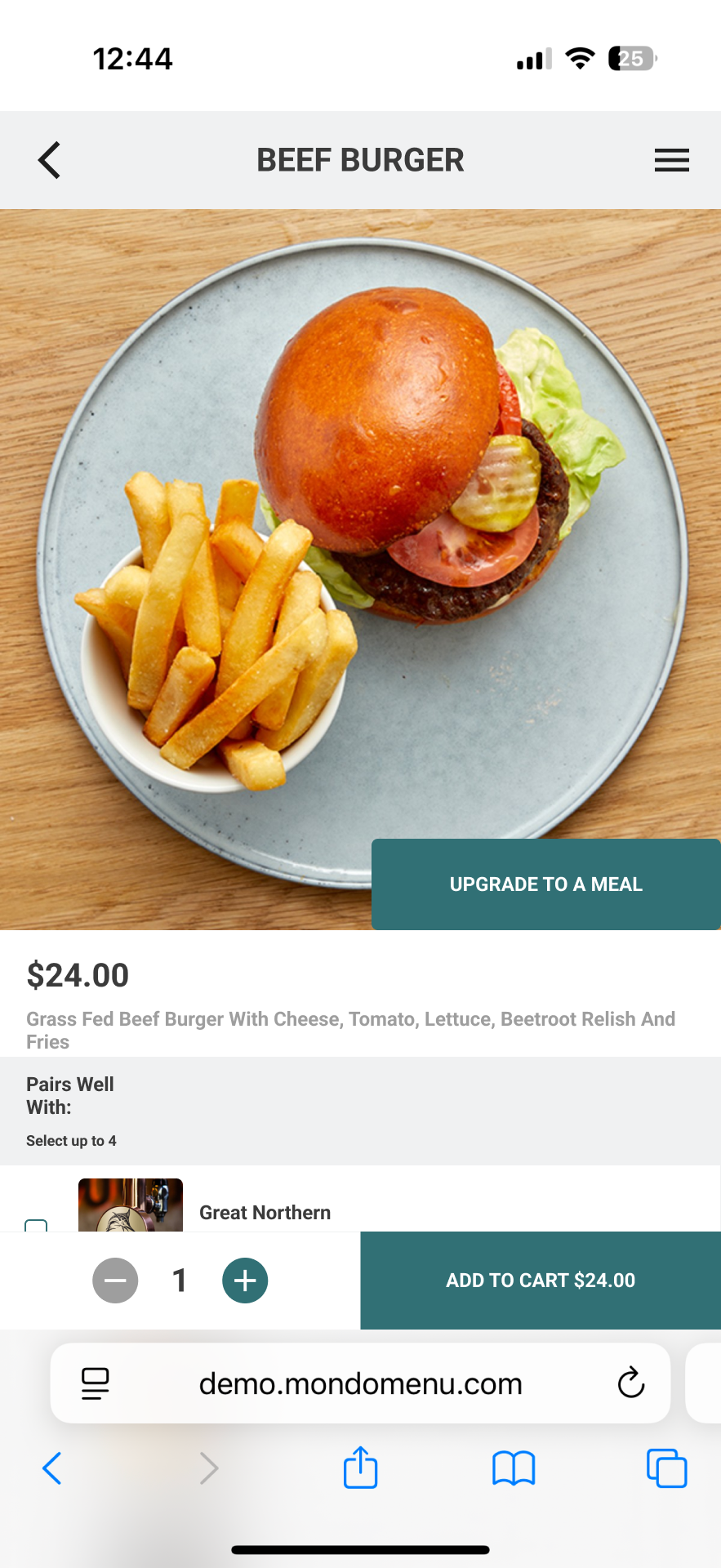
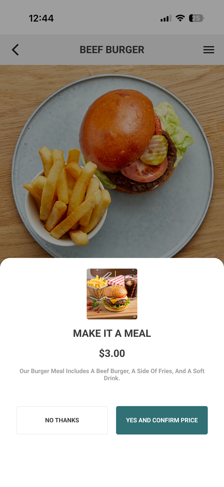
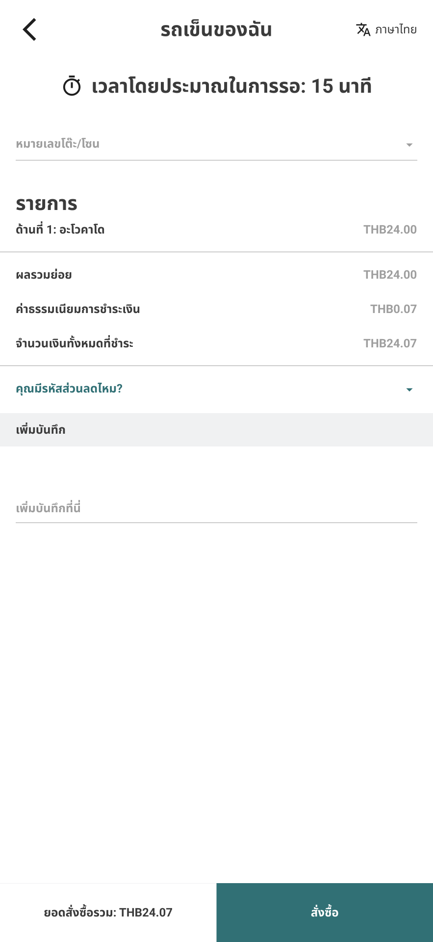
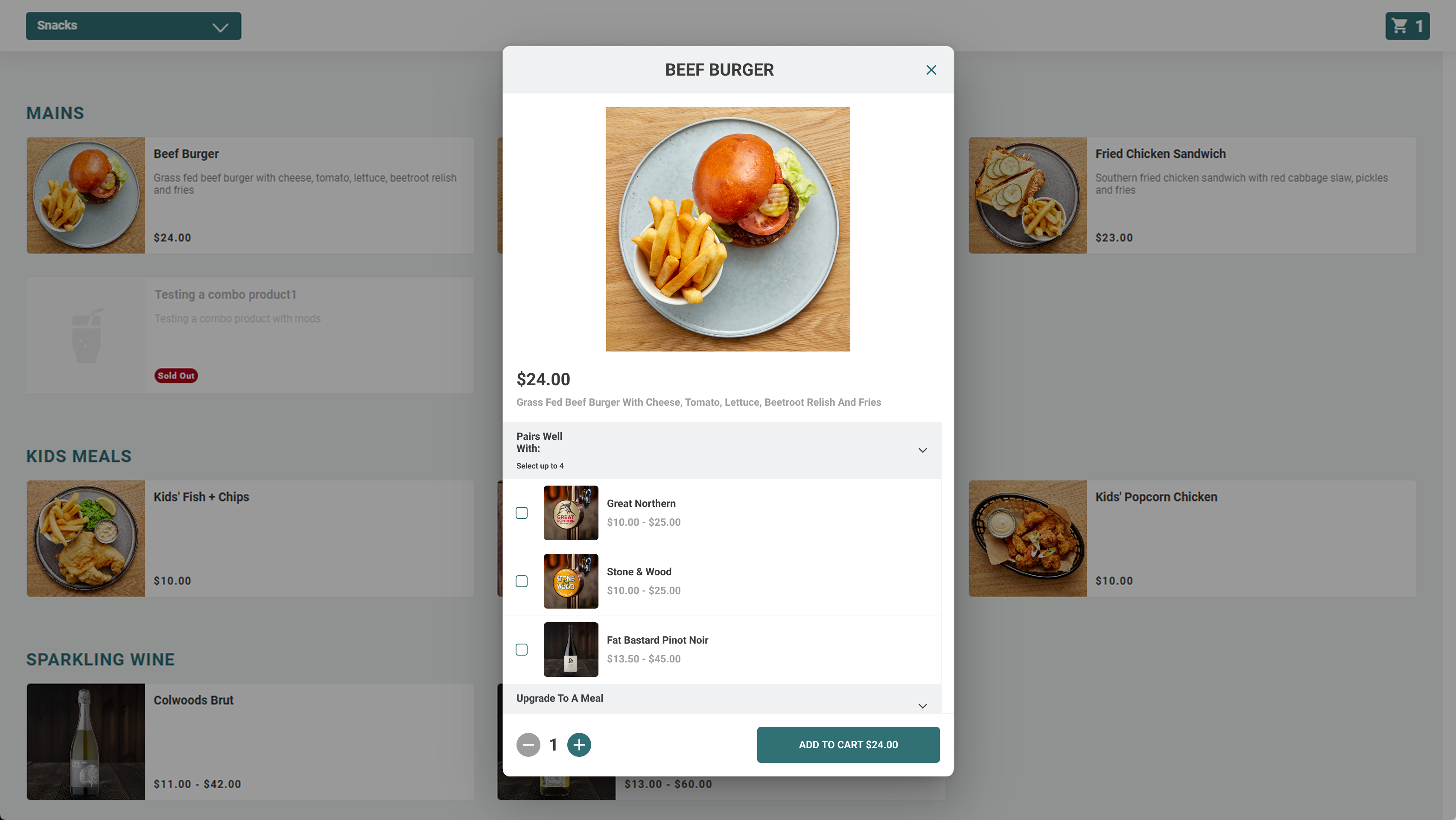
The approved work shows the same decision path on mobile and desktop — item clarity, optional upsells, and a commit step that stays calm. Kiosk is the standing equivalent of that path: large targets, high contrast, and chrome that assumes interruptions.
Mobile
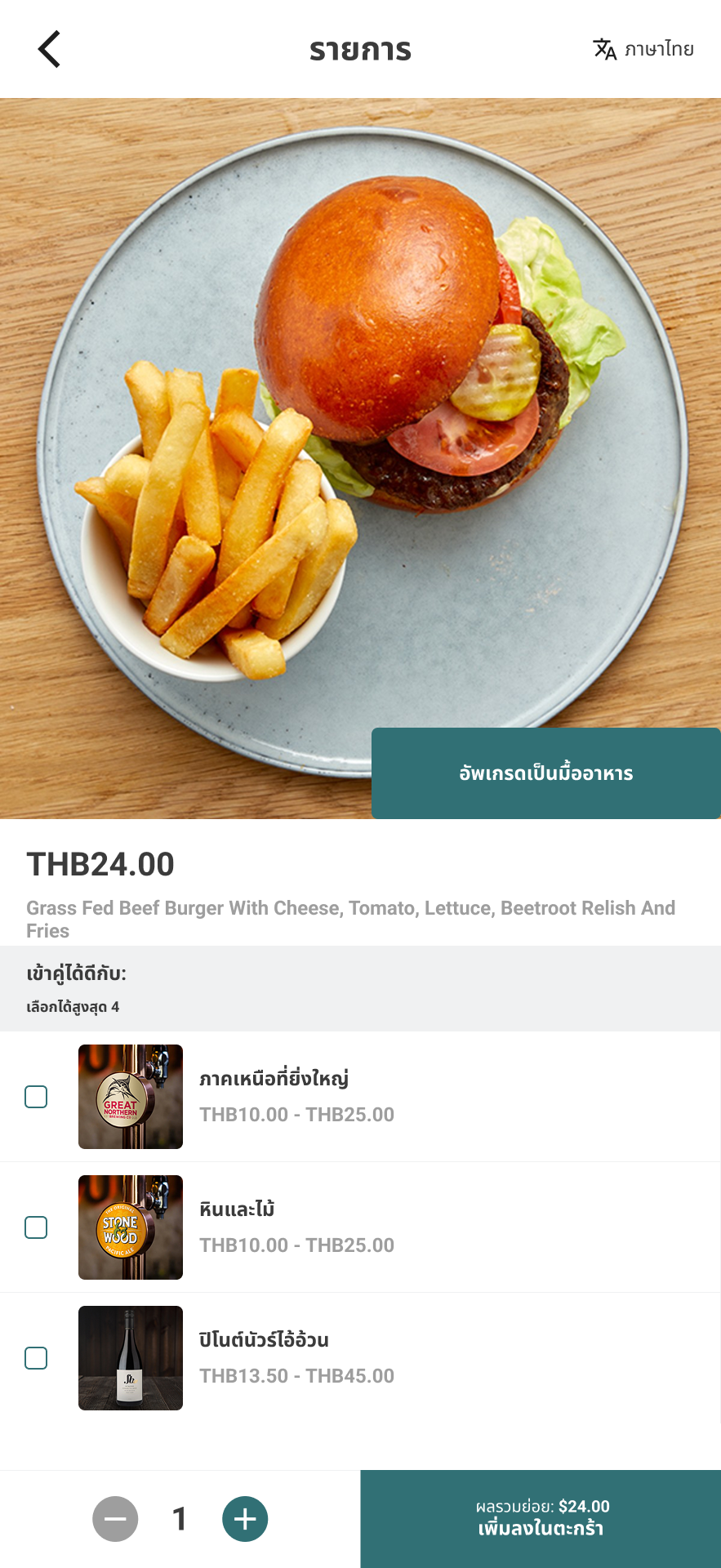
Item detail leads; meal upgrades and pairings stay optional and priced. The structure holds when the UI is localized — proof that presentation changed, not the model.
Desktop
Desktop keeps the catalog in view while the item modal carries modifiers and add-ons — more information at once, without a second mental model.

Accessible design
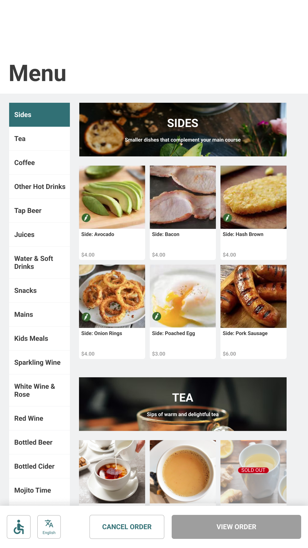
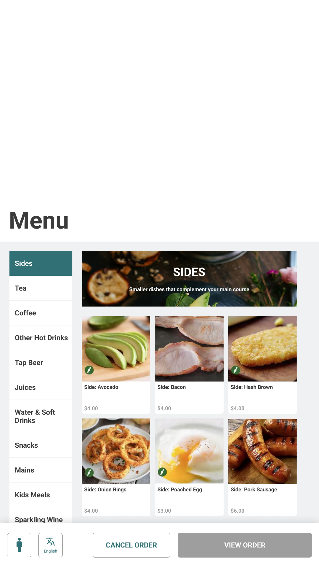
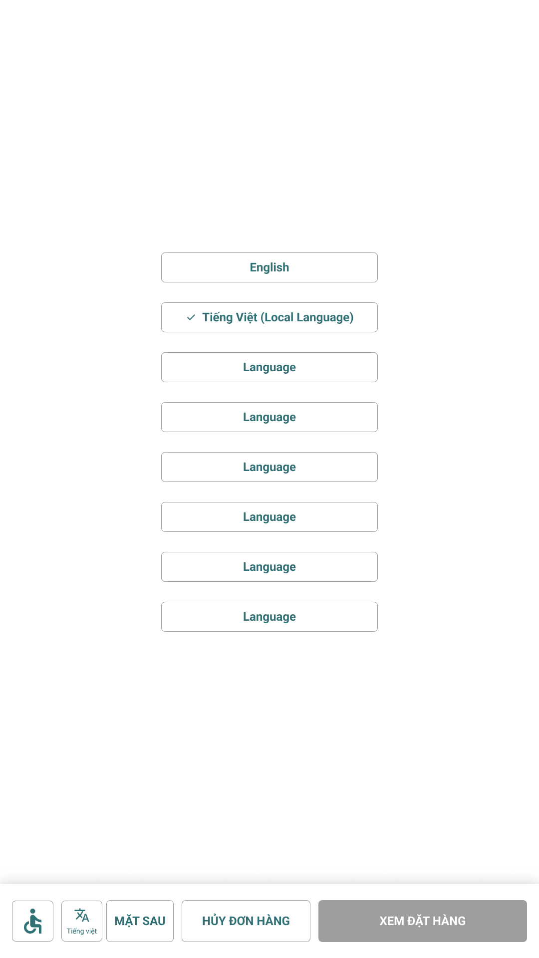
Assistive controls and language choice belong in the ordering chrome — not a settings detour. Guests stay on the same browse → customize → pay path when they adjust.
Reachable chrome
Accessibility sits with order actions in the persistent footer, so changing contrast or mode never means abandoning the menu mid-decision.
Language switch
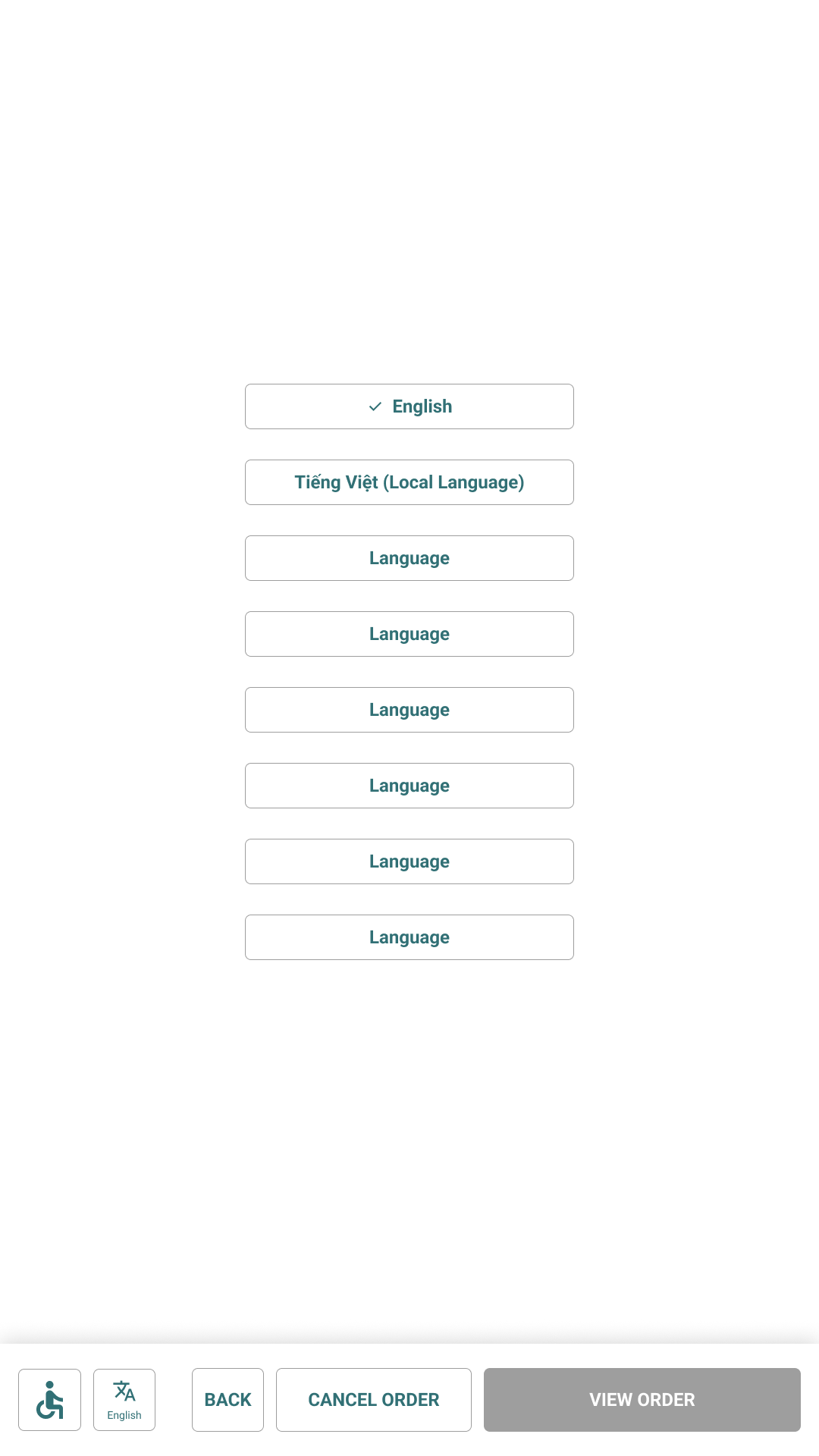
Choosing another language updates picker, footer actions, and the menu grid together. The browse → customize → pay spine stays familiar; only the presentation language changes.
Operations
Guest UX only stays honest if managers can publish the truth for this location — its hours, its floor, its regional offer — without fighting a one-size franchise template.
Problem · Hours
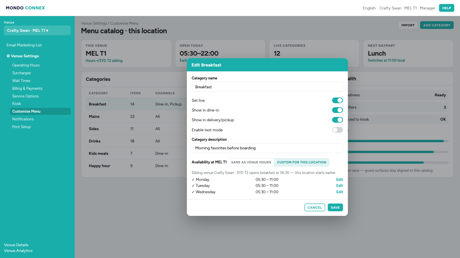
Sibling venues share a brand, not a schedule. MEL T1 may open breakfast at 05:30 while SYD T2 starts later. Category availability had to bind to the selected venue’s hours — not a franchise-wide default that would lie on the kiosk.
Why this shape. Hours live on the venue record and categories inherit or override them in place. That matched the POS/catalog model (per-location dayparts) and kept managers editing one location at a time instead of maintaining parallel menus.
Floor ops
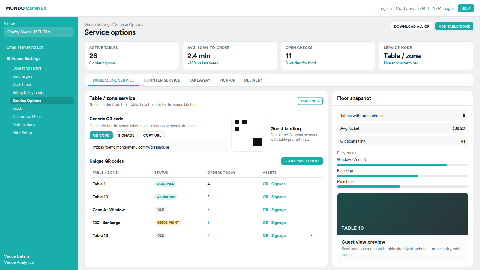
Table and zone QR setup stays beside a live floor snapshot so managers can see what guests will scan before they publish — same venue scope as hours and campaigns.
Problem · Campaigns
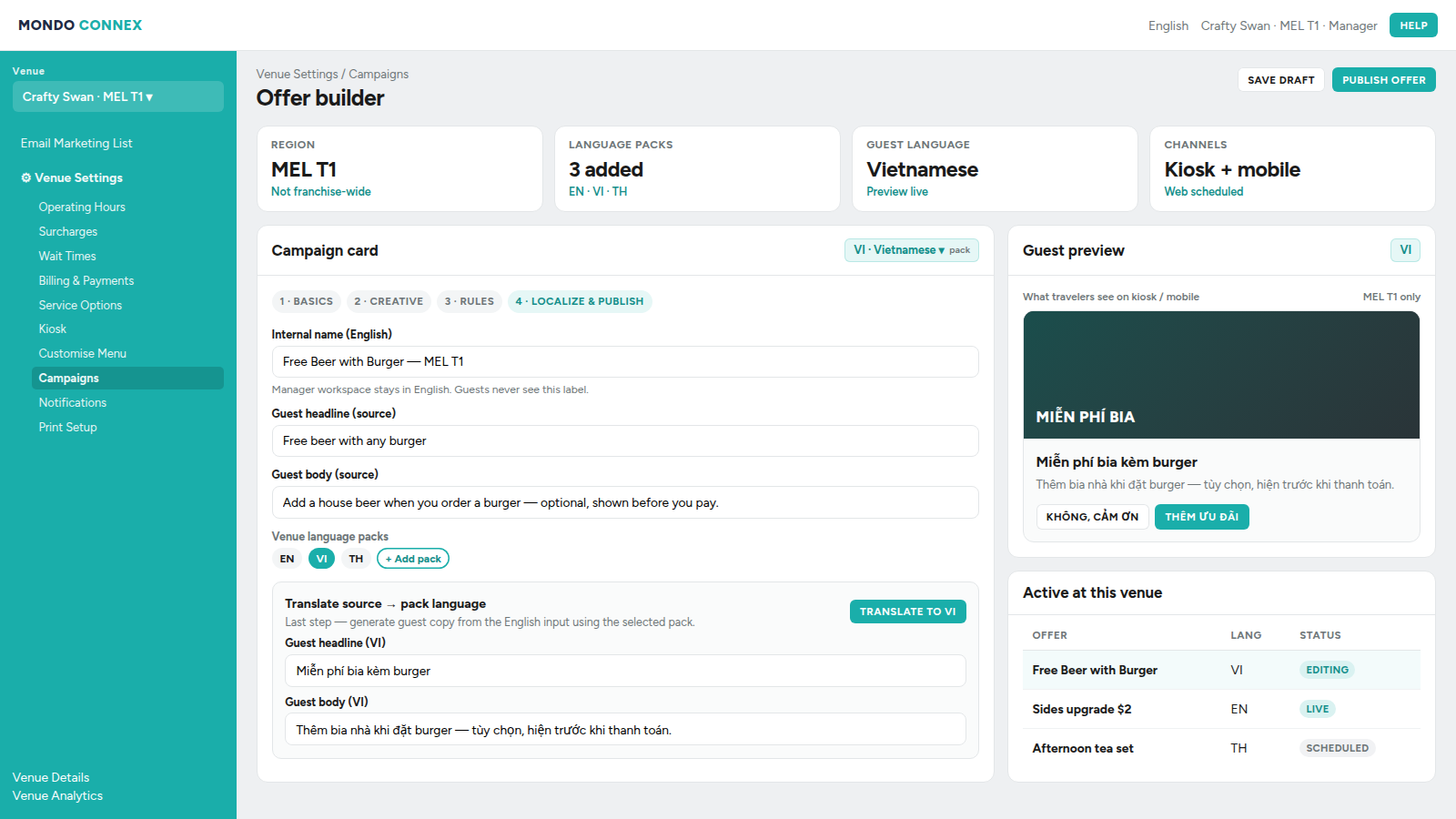
A campaign usually targets one region: creative, rules, and guest language all change. Regional managers still need to configure in English, then confirm the guest-facing copy in the local language before publish.
Why this shape. Language packs attach to the venue; the campaign card picks a pack (top right), and the final step translates English source fields into that pack. Manager chrome stays English — no second admin locale — while guest preview shows the generated local copy. Packs can be added as markets expand without redesigning the builder.
Close
Even with limited public assets, the through-line is design judgment under constraint: protect one ordering model, encode it in a living enterprise system, let surfaces adapt without drifting, and treat accessible design and operator tools as part of the product — not afterthoughts.
When boarding starts in twelve minutes, the interface should already know what matters.
Continue