Failure cost
$15,000
Average downtime and parts cost per missed failure.
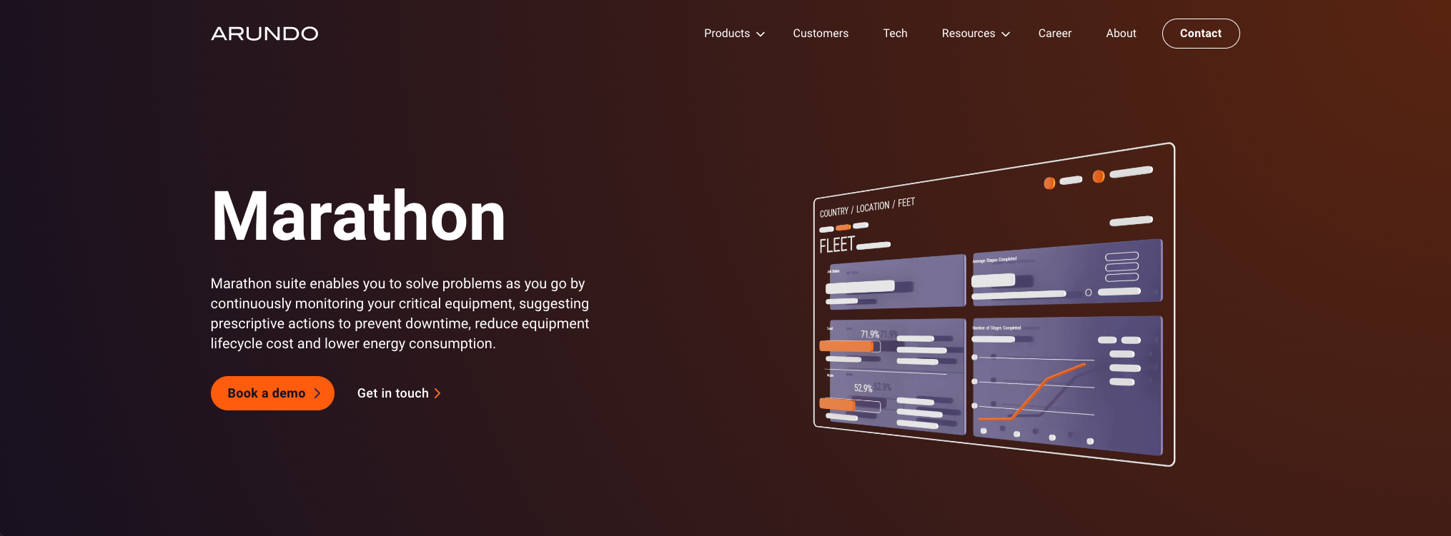
A desktop browser web app for energy companies to manage field assets, detect performance anomalies, and prevent costly failures before they happen.
Product definition
Failure cost
Average downtime and parts cost per missed failure.
Detection lag
Observed delay before anomalies reached the right person.
Trust
“I trust the sound, not the screen” — a recurring field quote.
Daily · Field engineer
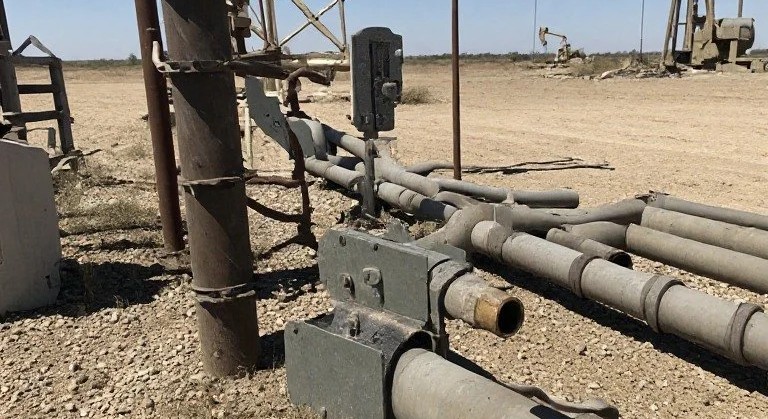
Needs status, alert priority, and asset drill-down — often from the data van between site walks.
Weekly · Fleet manager
Needs performance trends, savings evidence, and exports for executive review.
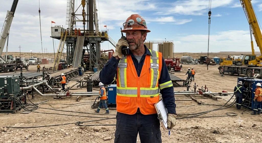
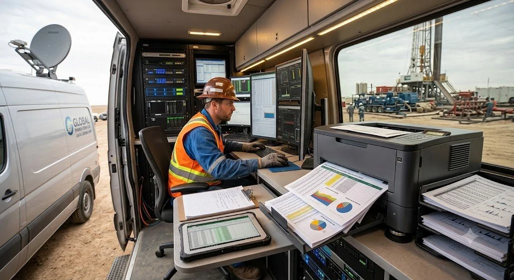
Research mixed site visits and shadow shifts with biweekly fleet-manager interviews across three accounts, plus workflow mapping from Excel and legacy monitors. From that fieldwork we surfaced four opportunity areas — then chose the one that could create the most value, fit the team we had, and generalize beyond a single client.
Opportunity map
Chosen
Give field and fleet a shared view of asset health, anomalies, and next actions — replacing swiveling between Excel, terminals, and paper logs.
Opportunity
Replace printed handover notes with a structured digital log. Useful, but secondary to seeing asset risk in time to act.
Opportunity
Polished savings and KPI decks for leadership. High demo appeal, lower daily urgency for the people who prevent failures.
Opportunity
Chat and escalation between crews and managers. Helpful coordination, but dependent on a trustworthy asset status source of truth first.
We chose asset management — the most valuable problem we could ship with this team, and generalize to other clients.
Product
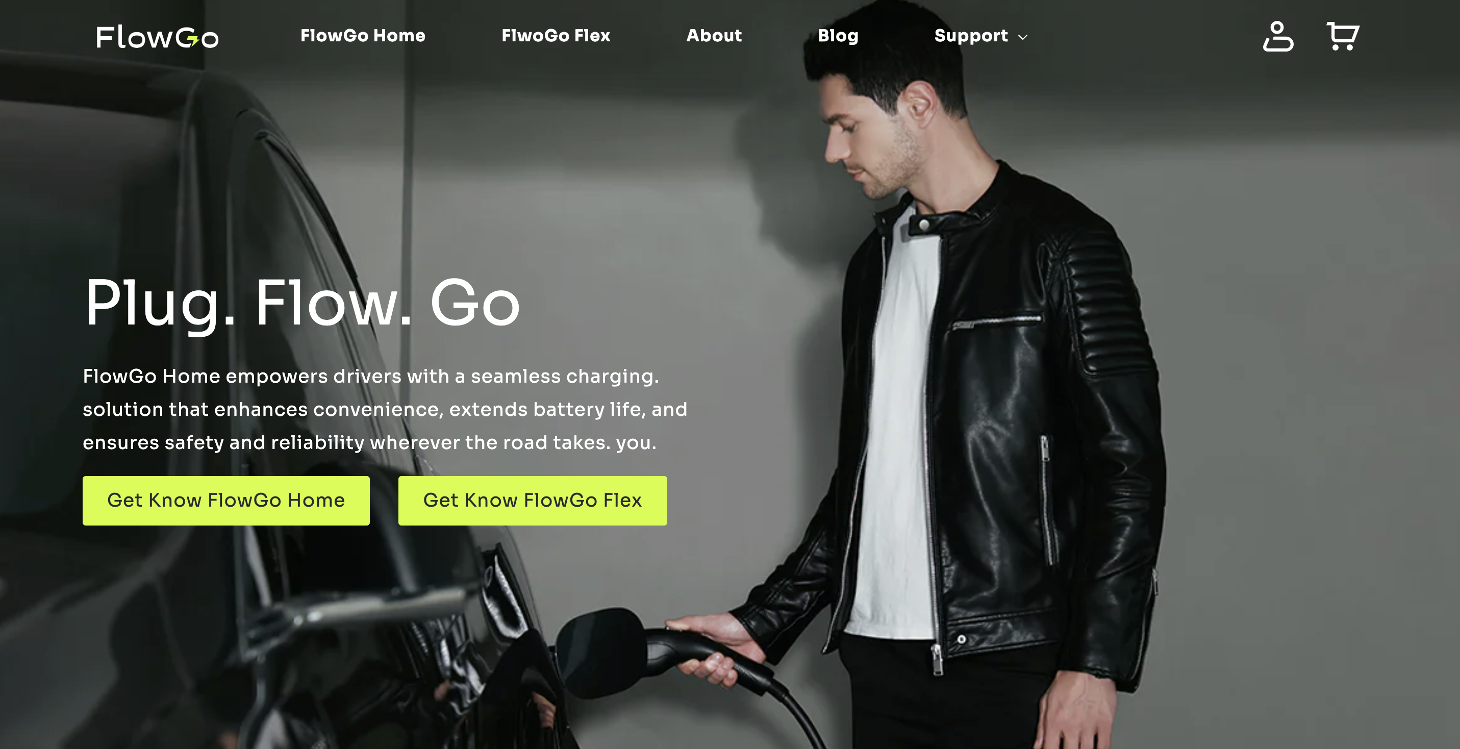
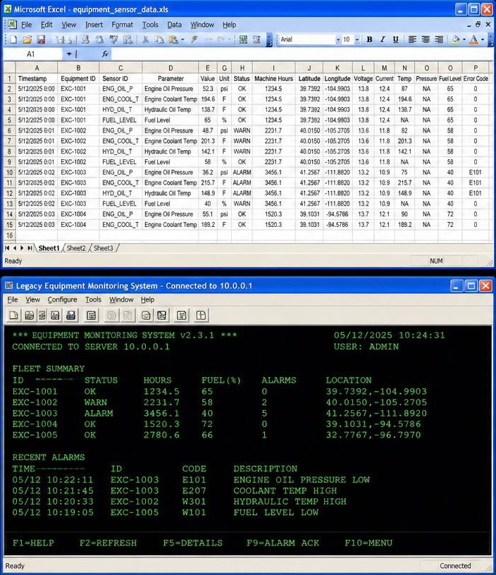
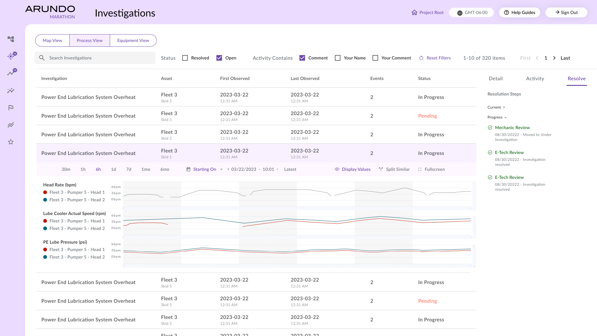
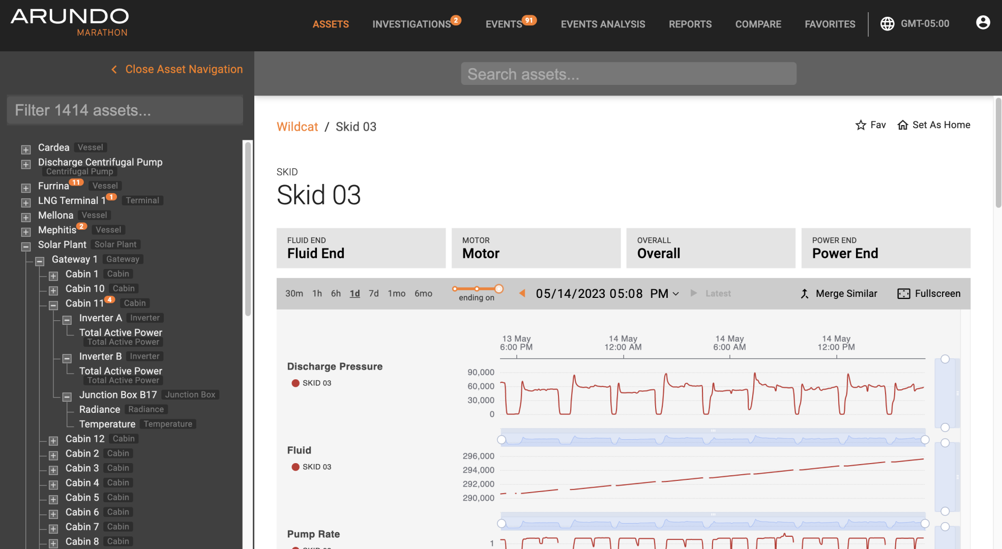
The before state was fragmented tooling: spreadsheet sensor dumps and a green-screen monitoring terminal. The after state is a prioritized Marathon canvas that surfaces what needs attention first.
Before
After
Visualize the workflow
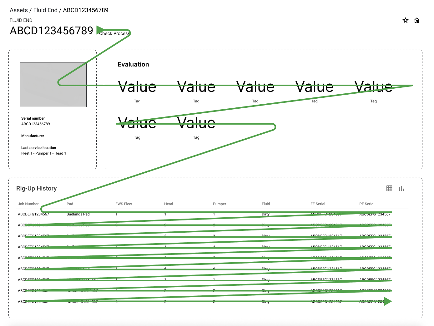
I translated the workflow into a layout that presents higher-priority information first, then tested and iterated with analytics to confirm that the most important content is seen quickly and understood under pressure.
Three constraint categories drove more decisions than any style preference: operational urgency, environmental cognitive load, and business trust (Excel/PDF exports for a conservative industry).
Core functions
Marathon is built for heavy-industry sites — oil & gas, natural gas, and similar field operations. The core loop is simple: see which equipment set needs attention, understand why from live performance, then move the work across roles without losing context.
01 · Equipment overview
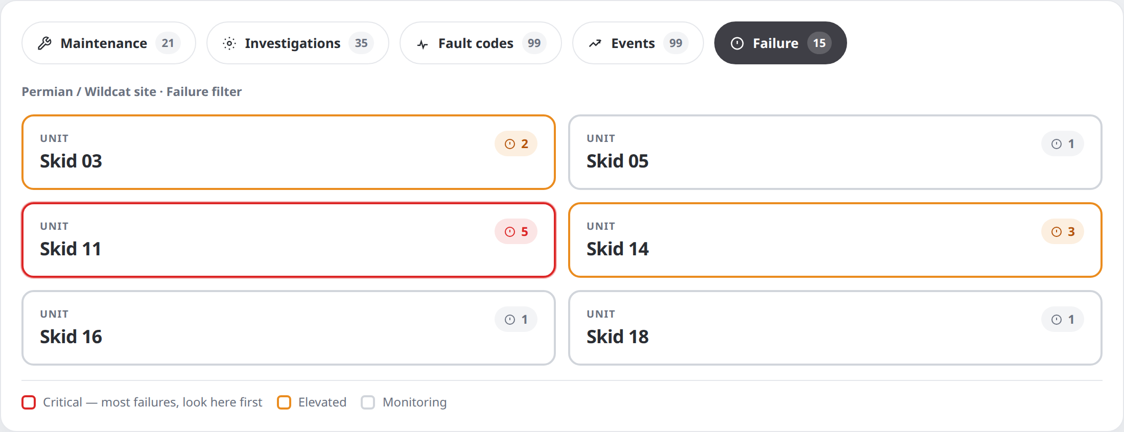
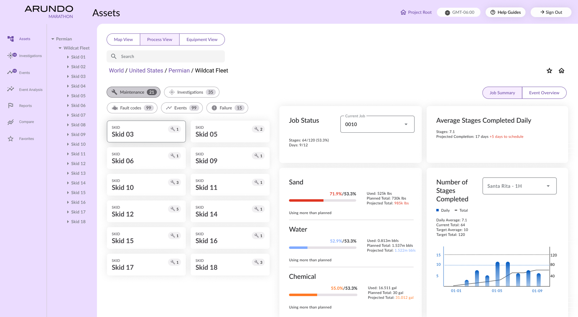
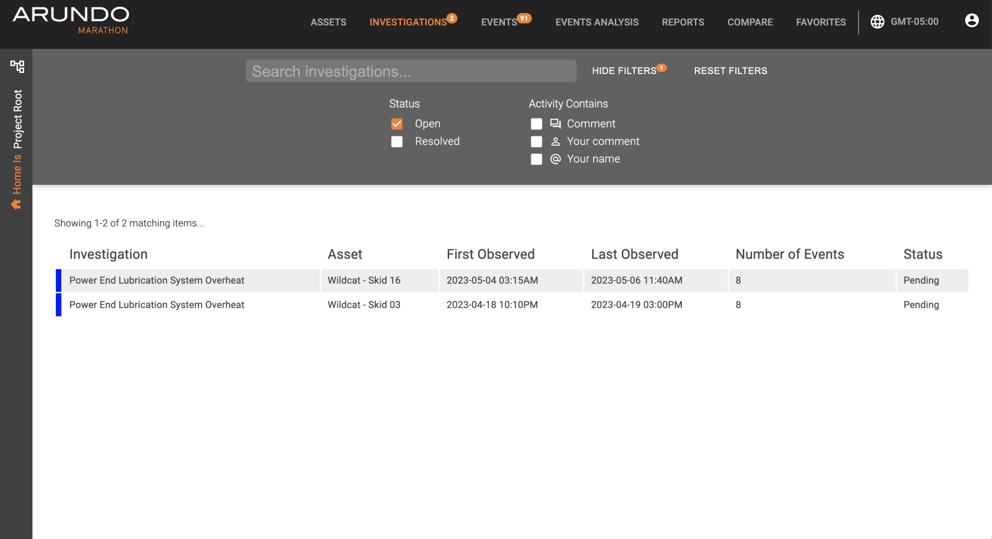
Every equipment set appears as a card. Borders alone carry severity — red for units with the most failures (open those first), orange-yellow for elevated risk, quiet gray for monitoring. The chips above explain the badge icons and double as filters, so a manager can switch from Maintenance to Failures and immediately re-rank what needs attention across the site.
02 · Drill in
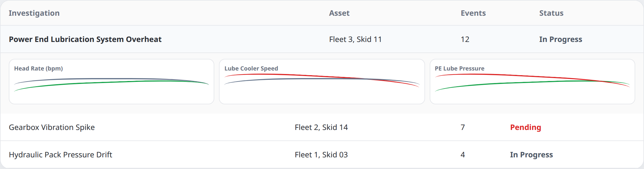
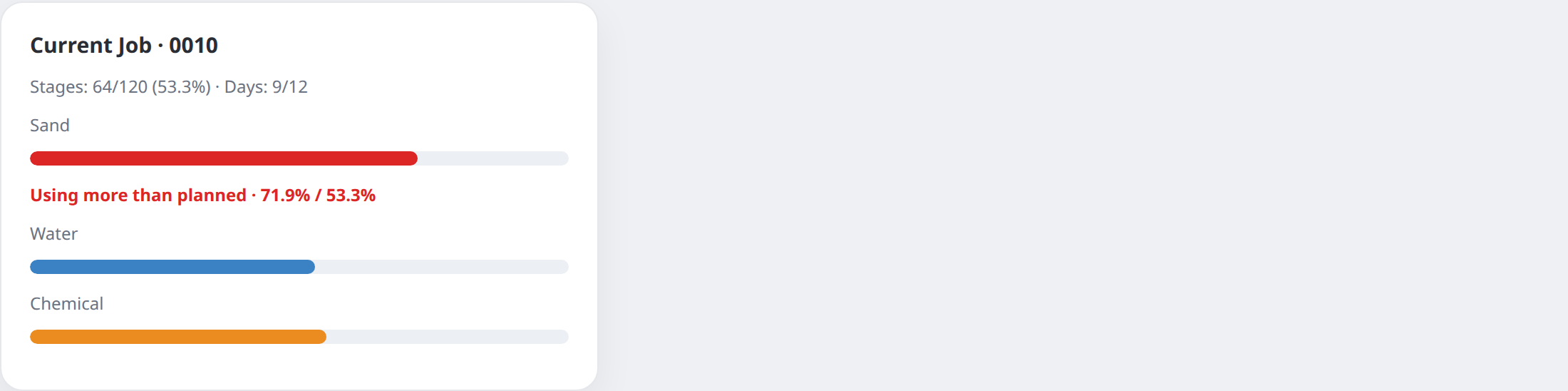
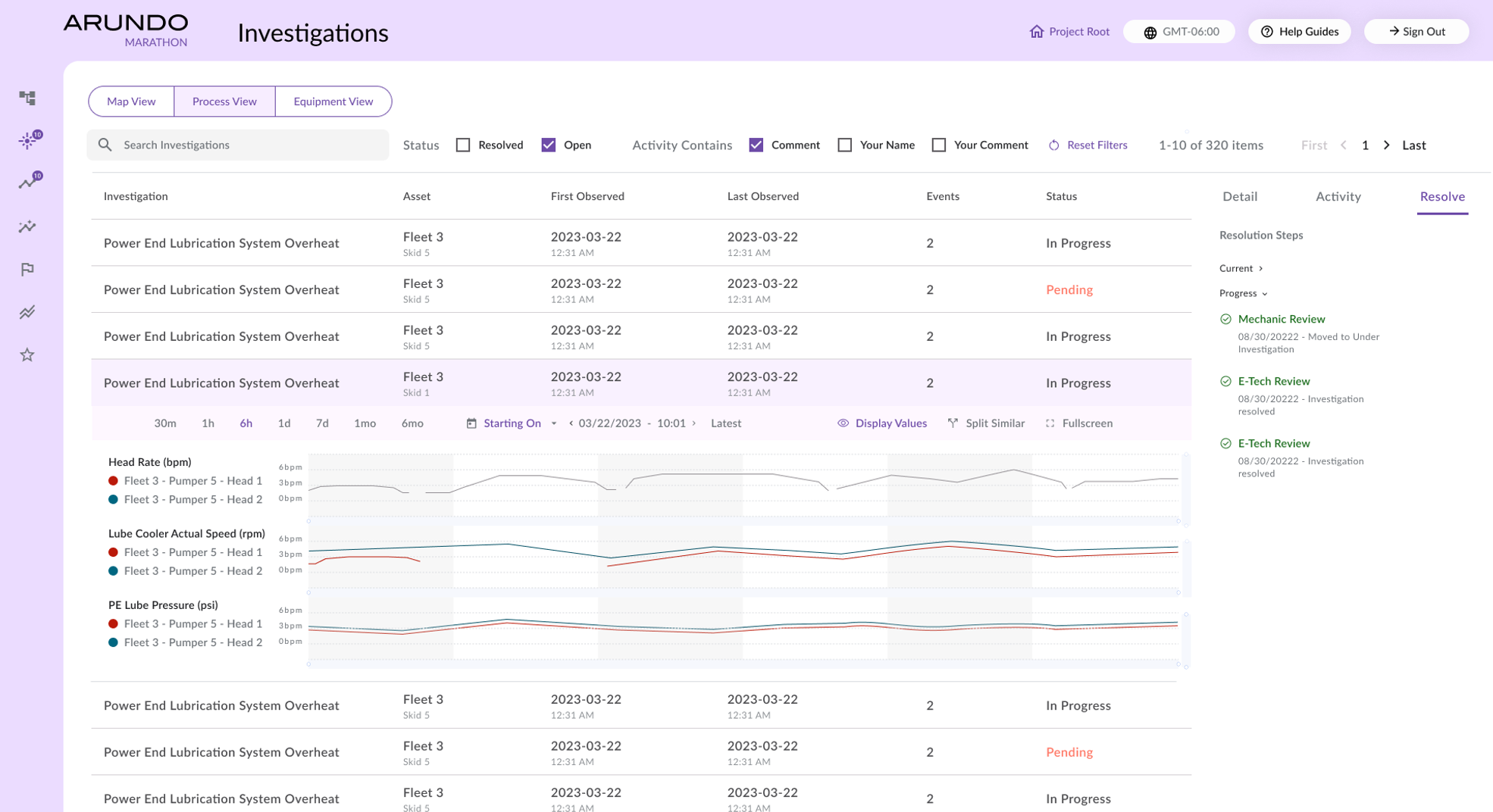
Selecting a critical card opens the investigation with the signals that triggered it — head rate, cooler speed, lube pressure — so the team diagnoses from charts, not from a scattered alert list. Off-plan job usage stays visible next to the same assets.
03 · Collaborate
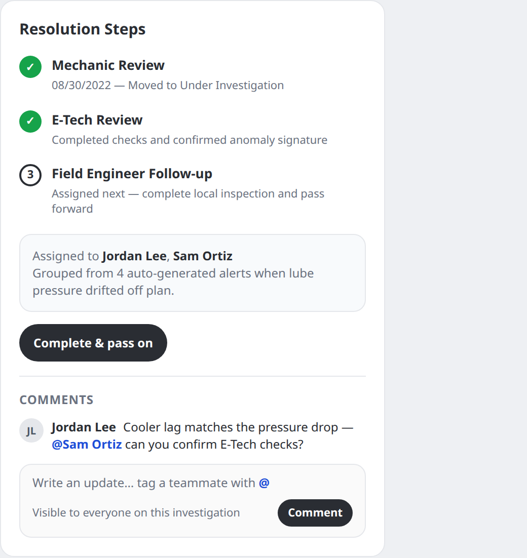
Managers assign the investigation; engineers complete their step and pass it forward — Mechanic → E-Tech → Field follow-up — inside the product. Comments under the resolution steps let teammates type updates and tag coworkers without screenshot threads.
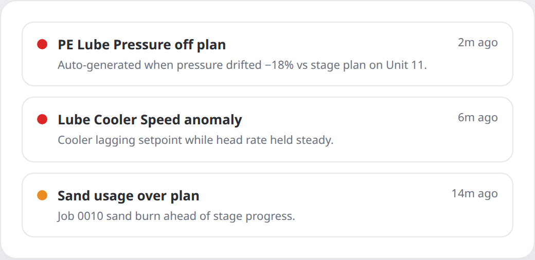
Detect
Alerts fire on their own when metrics drift off plan.
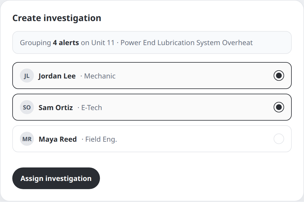
Group & assign
Managers bundle related alerts into one investigation and pick the right roles.
Complete & pass on
Each role finishes its step, comments with @tags, and advances the chain.
Challenge · Expand for detail
Chart vs spreadsheet for provider claims
From the “right” design answer, through a business constraint, to a design-education outcome.
01 · Problem
Failed equipment needed a claim package
When a unit failed, the site had to send recent performance evidence to the provider for refund or replacement.
02 · The supposed right solution
Export the chart operators already trust
Design’s answer: a short written brief plus the same line chart used in the product — fast to read, easy to print, aligned with how people triage on screen.
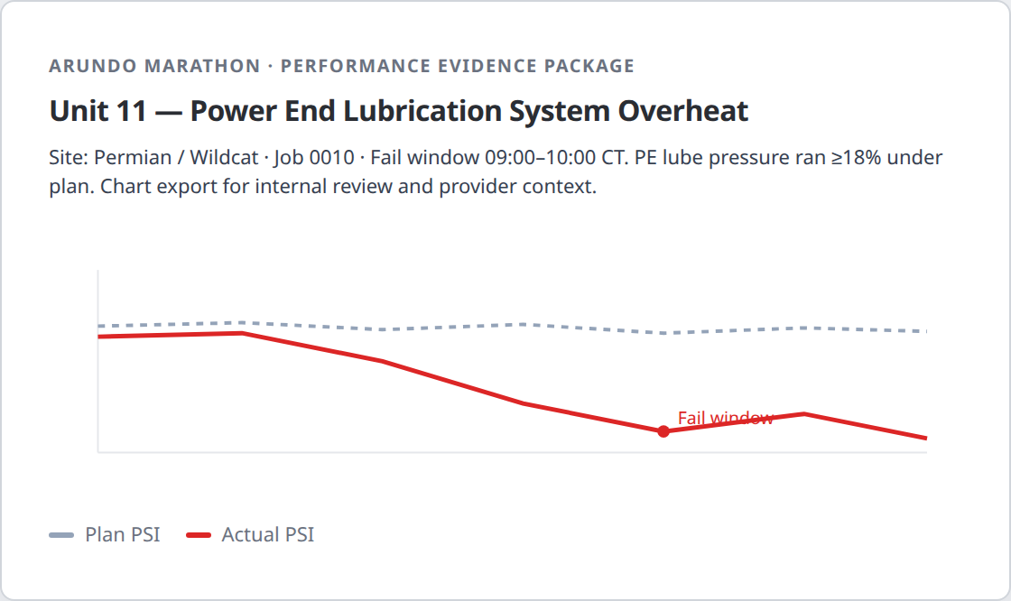
03 · What the client wanted
A raw spreadsheet — for business reasons
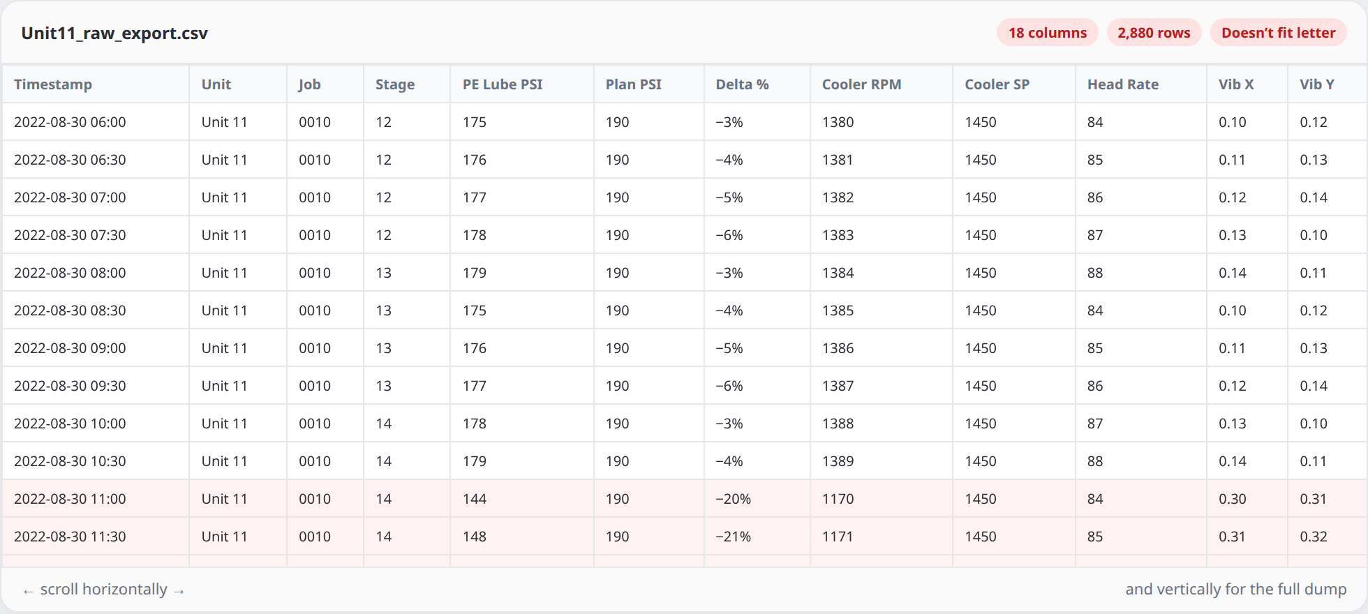
The customer pushed for a full raw data sheet instead. That dump was long and wide: scroll both ways on screen, and it wouldn’t fit letter paper.
04 · Confirming the real constraint
I asked PM why — then designed to the answer
Senior field engineers were used to spreadsheets. More importantly, the provider’s intake process expected raw tables — that was how they logged claims. So the sheet wasn’t stubbornness; it was a partner workflow.
05 · What we built
Both options — and a sheet that can print
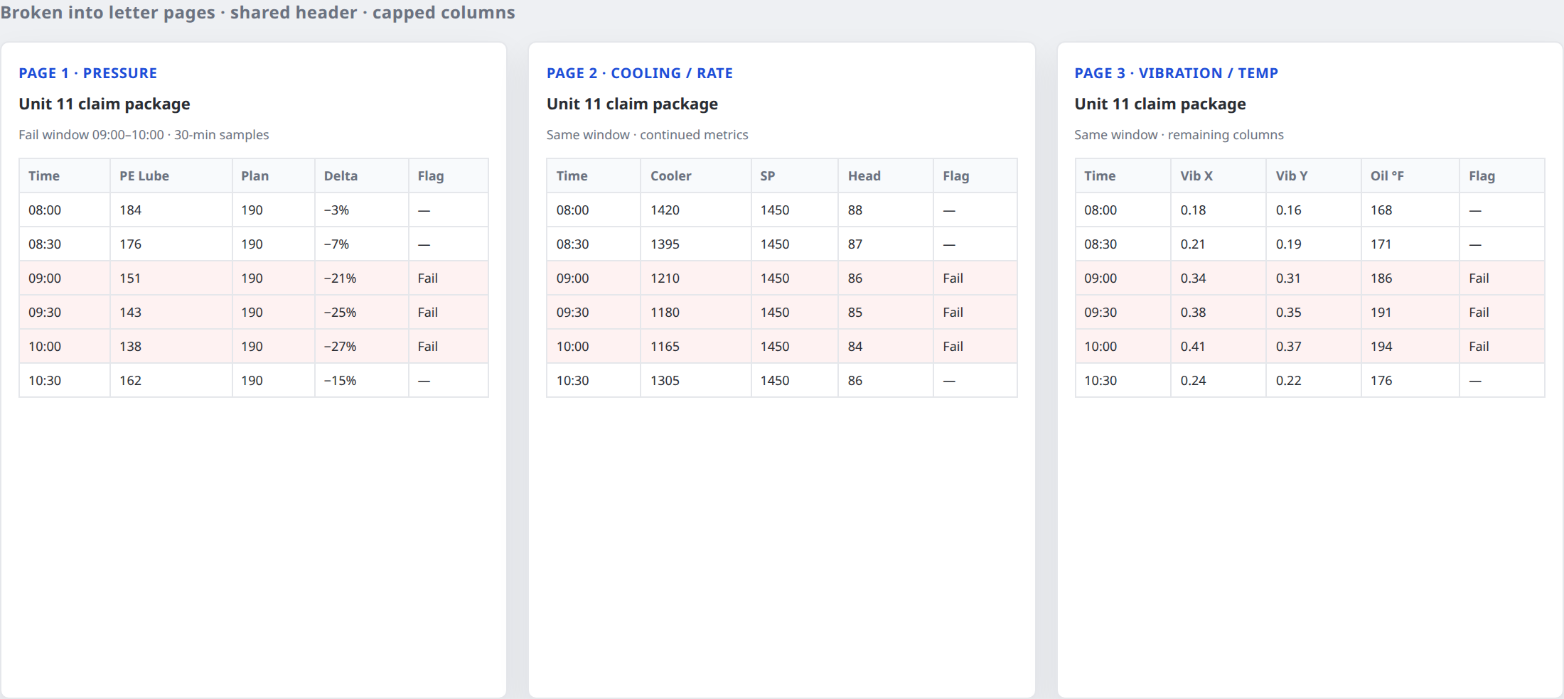
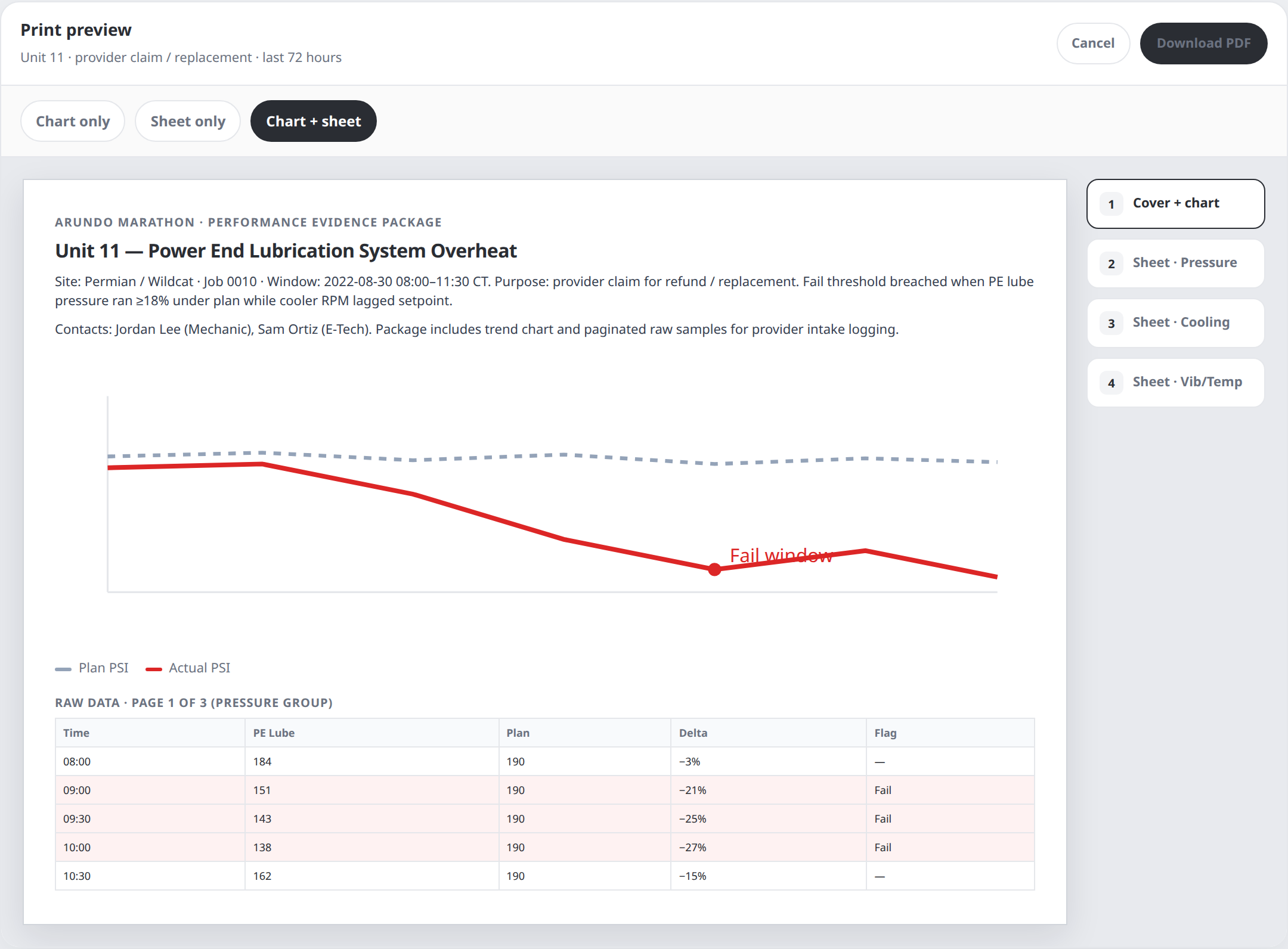
Keep the raw values providers need, but break them into letter pages by metric group. Offer chart only, sheet only, or chart + sheet — each package led by a written brief.
06 · Design education
Then we pushed past the legacy workstyle
With direct access to fleet managers, I showed how charts cut claim time versus raw sheets. They helped educate their teams. Habits moved toward chart-first over time — a product-design case for changing how a client and their provider partner work, not only how a screen looks.
Handoff & follow-up
Handoff
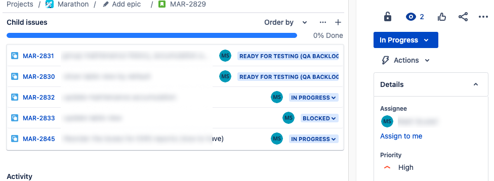
I partnered with PM and engineering in agile sprints: Jira tasks carried specs and expected behaviors, design stayed one sprint ahead of development, and I remained available for questions through release QA.
Post-launch analytics
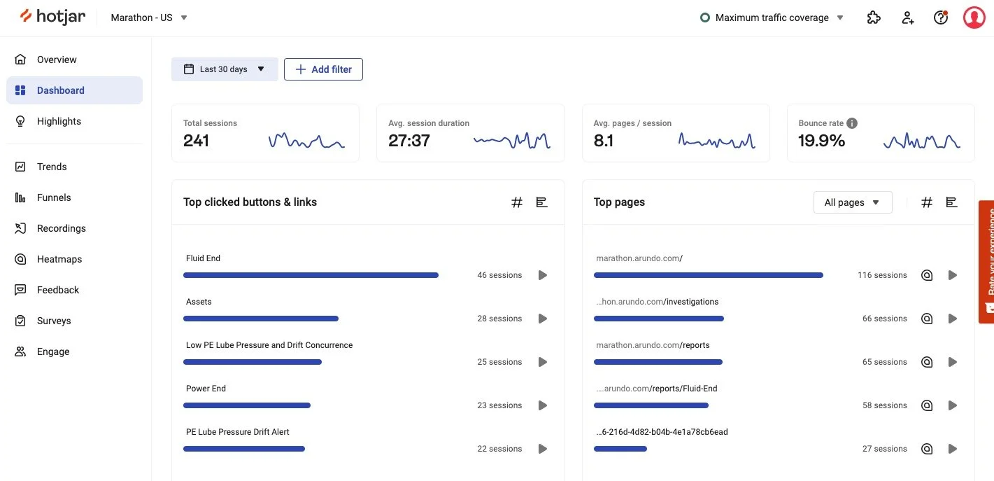
After release I used Hotjar to see whether operators followed the intended path, where they hesitated, and which surfaces actually became daily tools — then used those signals to spot follow-up problems early.
A/B testing
For contested layouts I ran product-analytics A/B tests to see which design helped operators complete triage faster — evidence over preference.
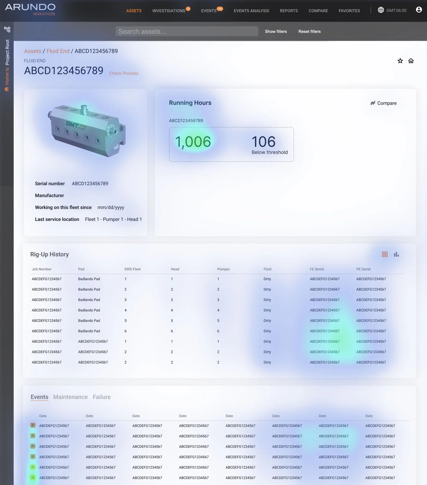
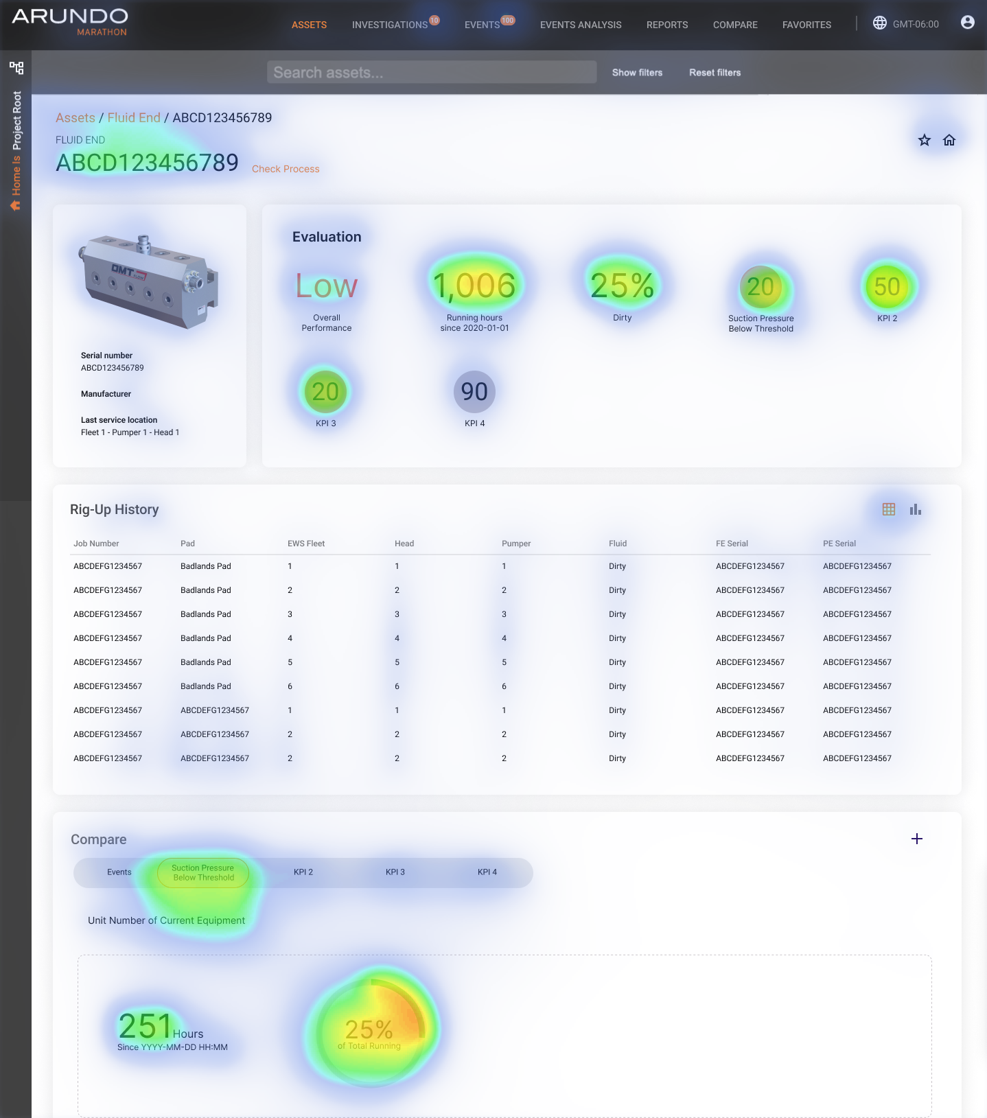
Success. Engagement rose 225% after release. We judged the work successful when operators adopted the intended path and anomalies reached them faster — backed by Hotjar/usage, client value (~$900K annual revenue per signed client), and the ~$15K failure-cost framing that defined the original problem.
Design system
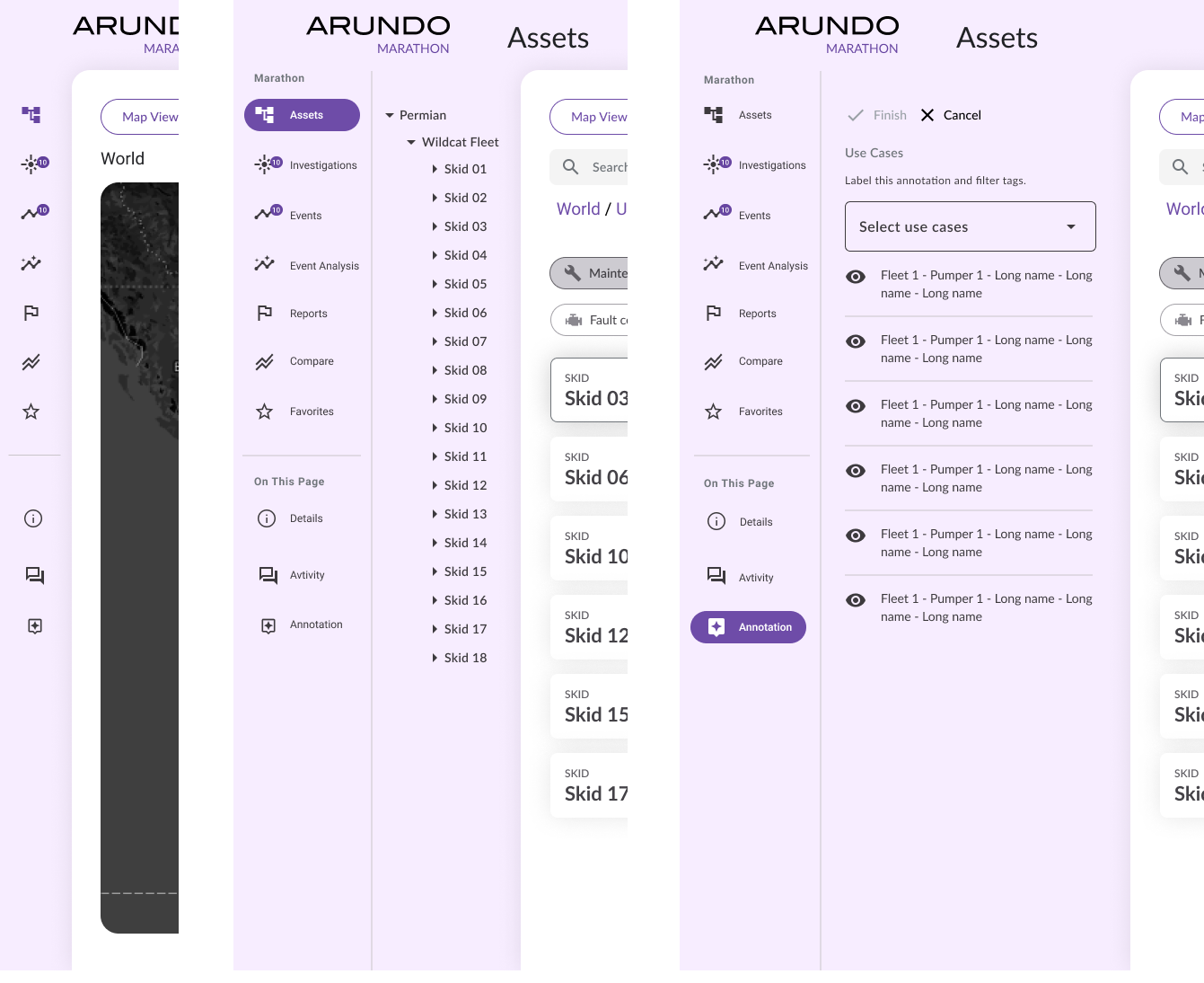
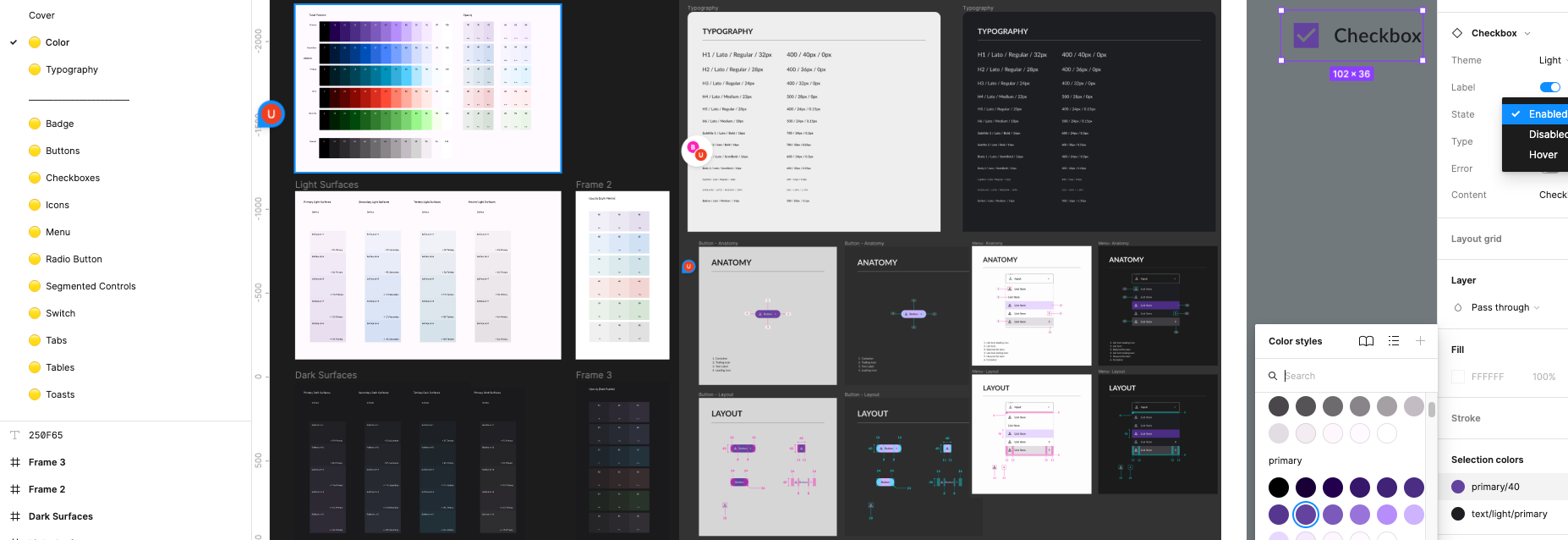
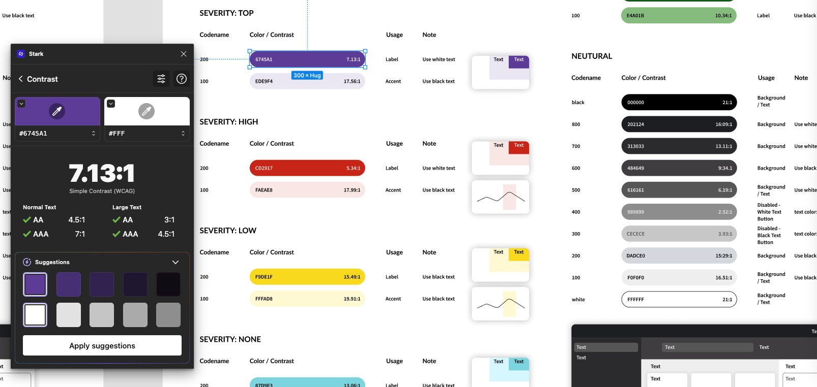
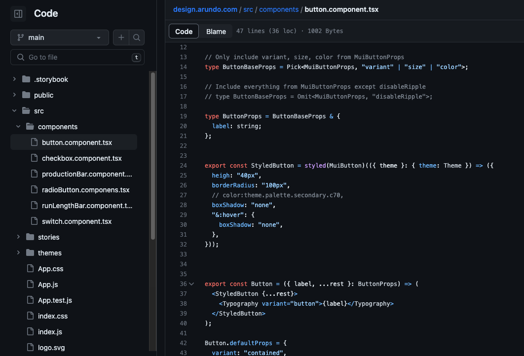
As the product scaled, we refreshed the system — starting with marketing/branding, then bringing product UI into a cohesive suite. The update was about usability and trust as much as trend: WCAG-compatible color, type, and interaction patterns, tracked from Figma through development and design QA on a Kanban board.
Product layout
Navigation
Figma library
Accessibility
Design ↔ engineering
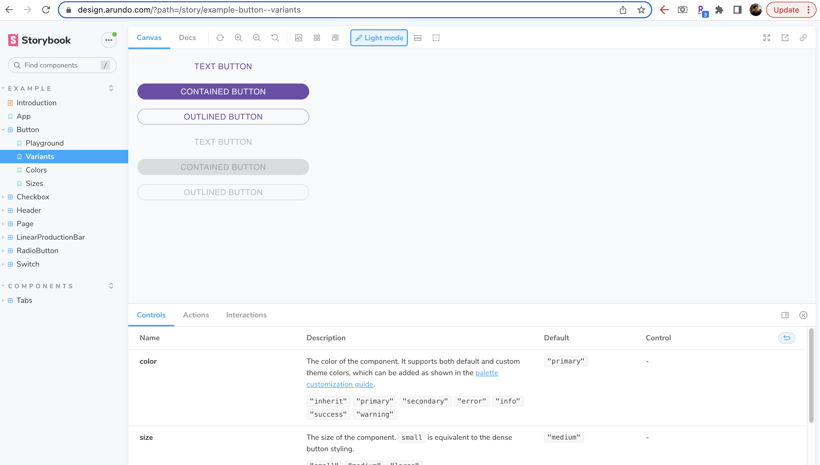
Coded system
Retrospective
For startups like Arundo, precise pain targeting and differentiation matter more than visual novelty. Marathon taught me to design through ambiguity, collaborate across time zones, and earn trust in a conservative market — including the slower work of changing how clients and their providers exchange proof, not only how screens look. It is now a rising service in equipment analytics serving multiple clients.
Continue